-
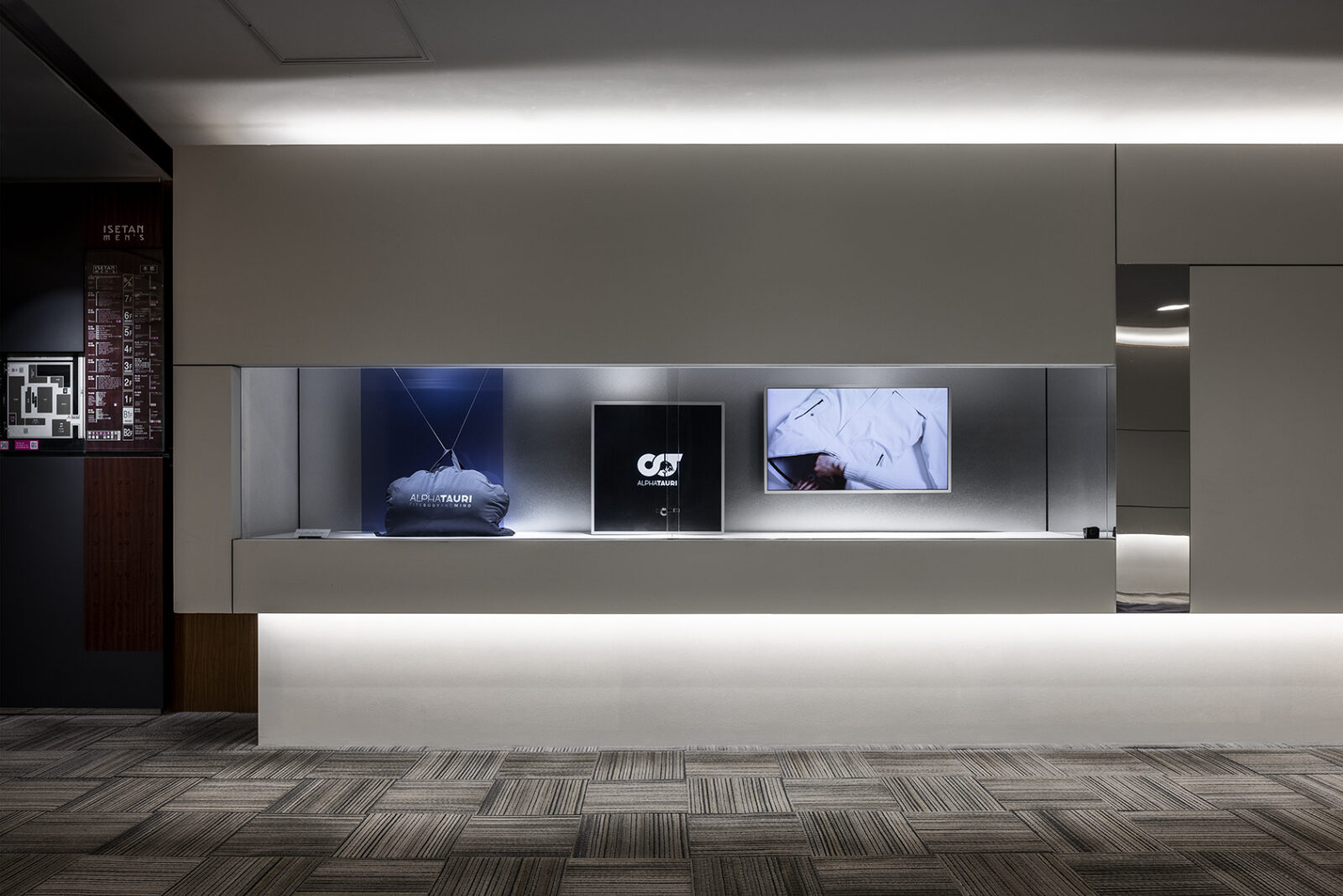
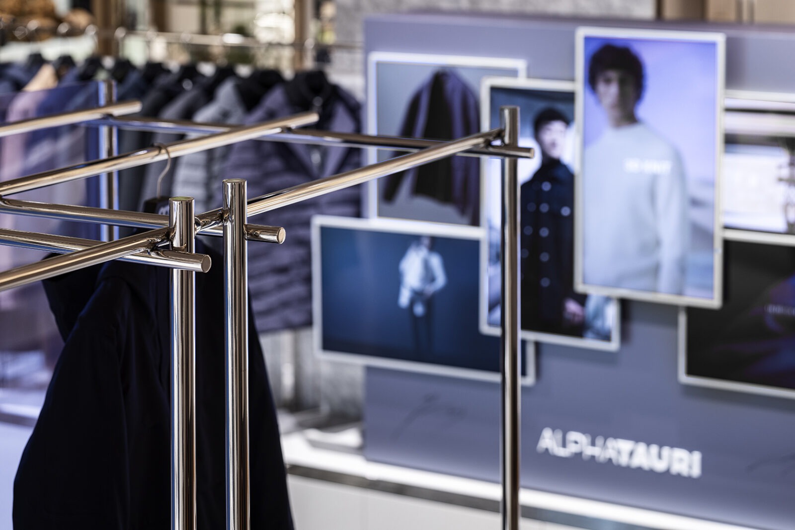
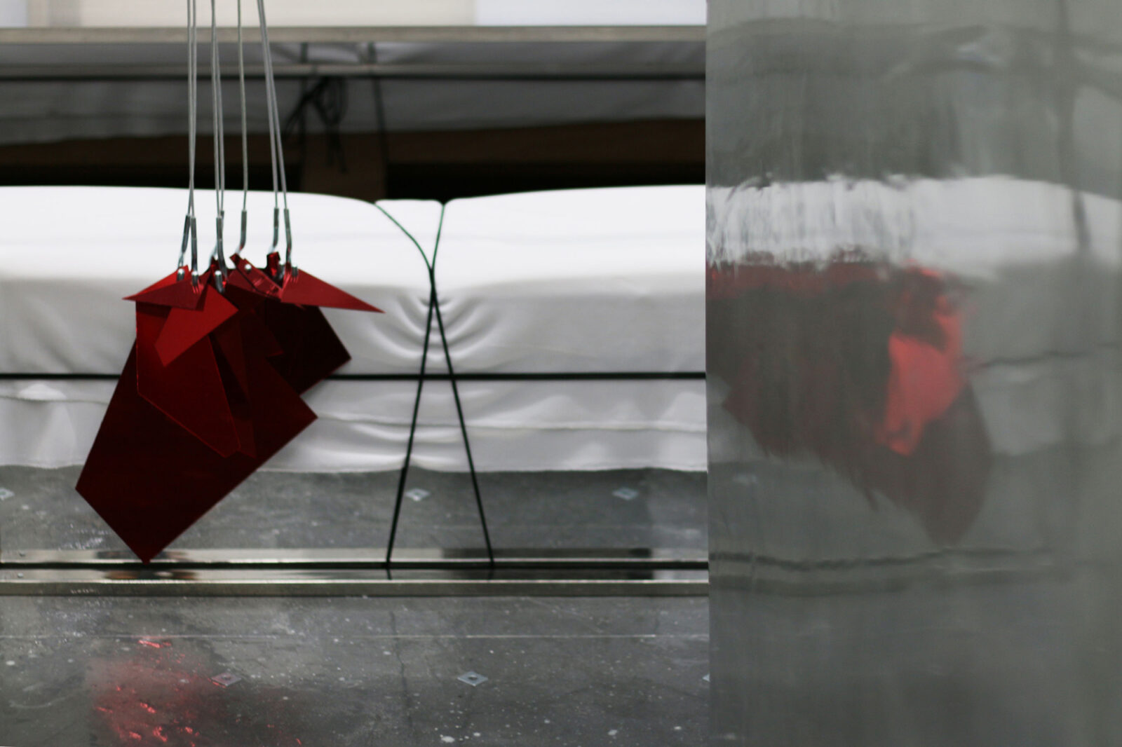
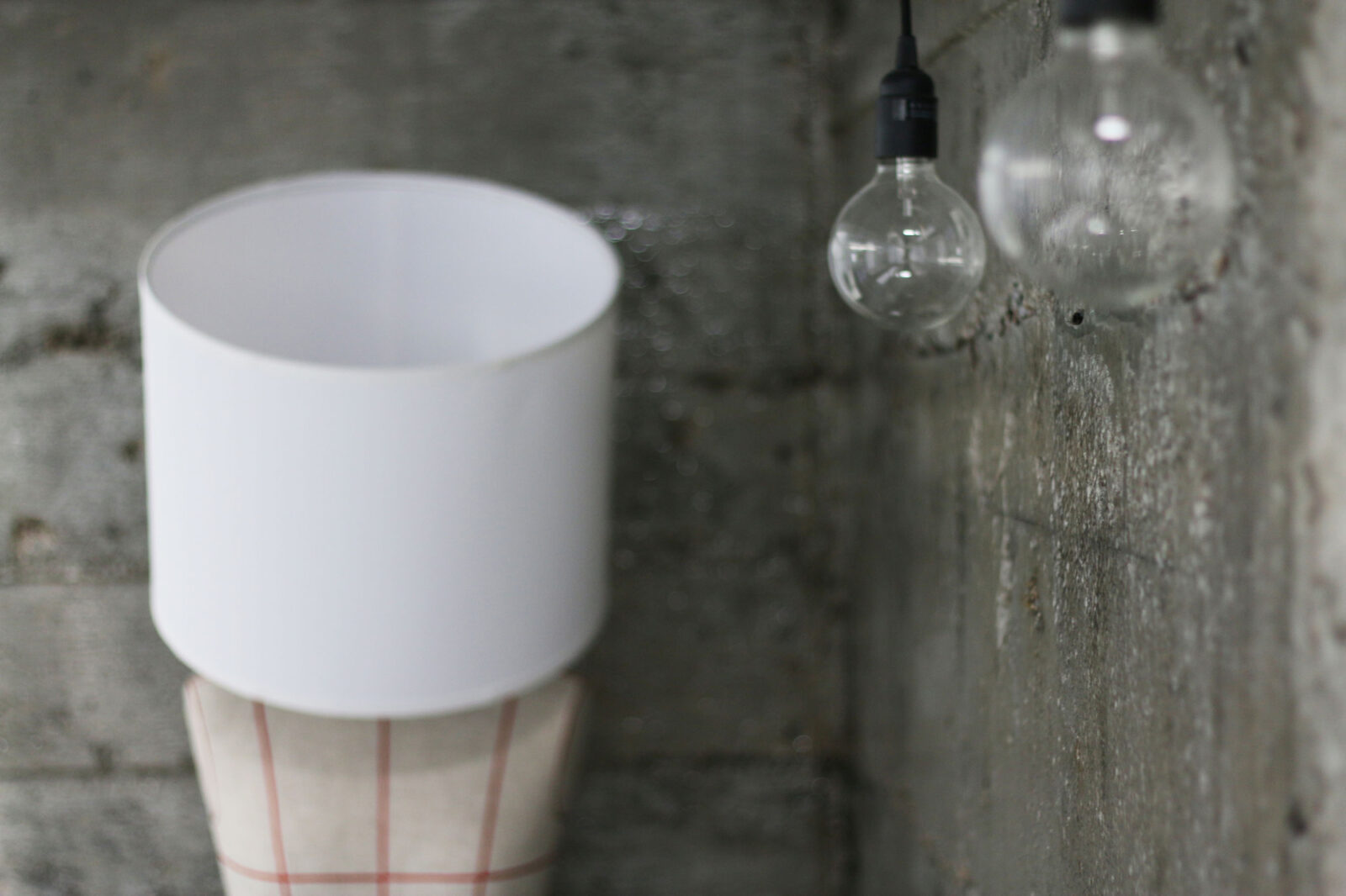
Show window design for the Austrian fashion brand "AlphaTauri" at Isetan Shinjuku, created to mark the brand's arrival in Japan. SHU TO / was responsible for the facility’s show window design along with the interior planning of the pop-up store.
The composition utilized the 2022-2023 AW key color, blue, integrated with a rhythmic arrangement of video displays and atmospheric staging to create a cohesive spatial experience evocative of a live orchestra. -
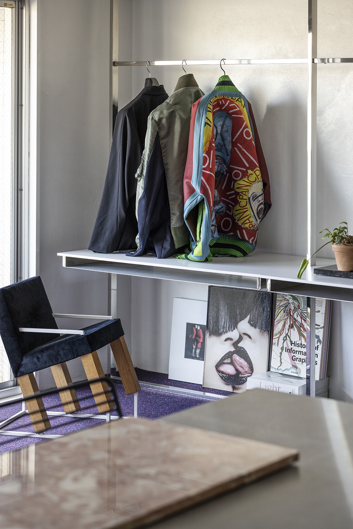
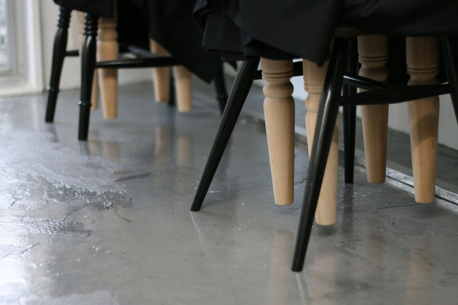
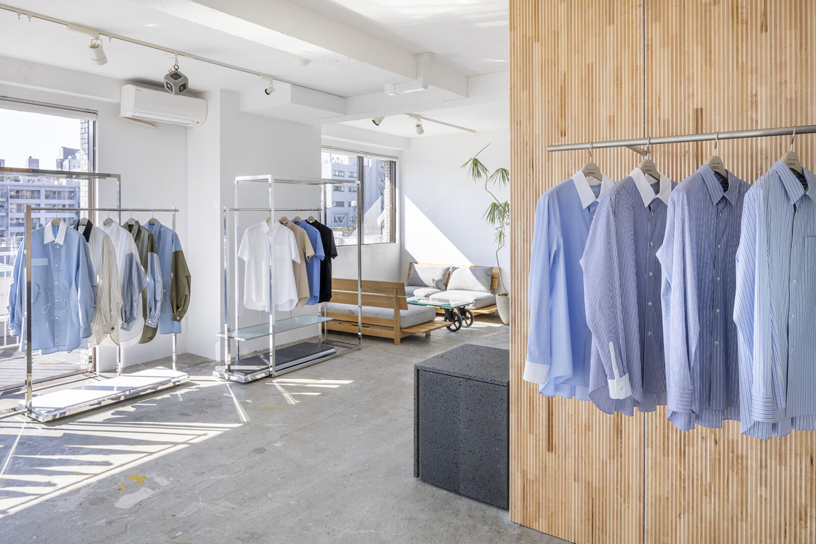
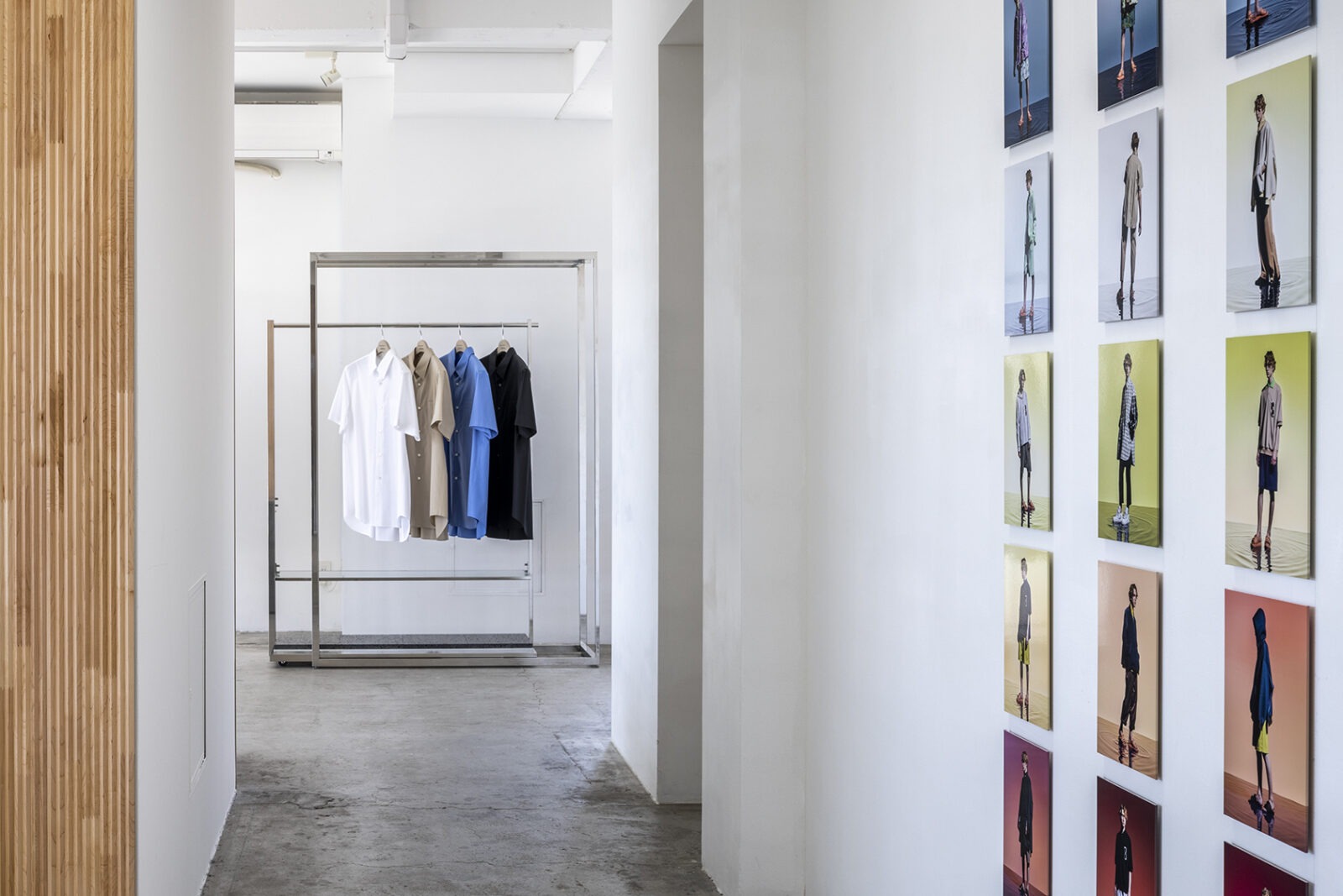
Design for the new showroom of "ON TOKYO SHOWROOM," a sales platform with a global network connecting Japan and the world through a multi-faceted marketing approach.
The project utilized existing hanger frames produced by SHU TO / for the previous showroom. To complement these, newly designed and fabricated elements were integrated, including frame-inserted benches and detachable floor-mounted hanger rack bases. -
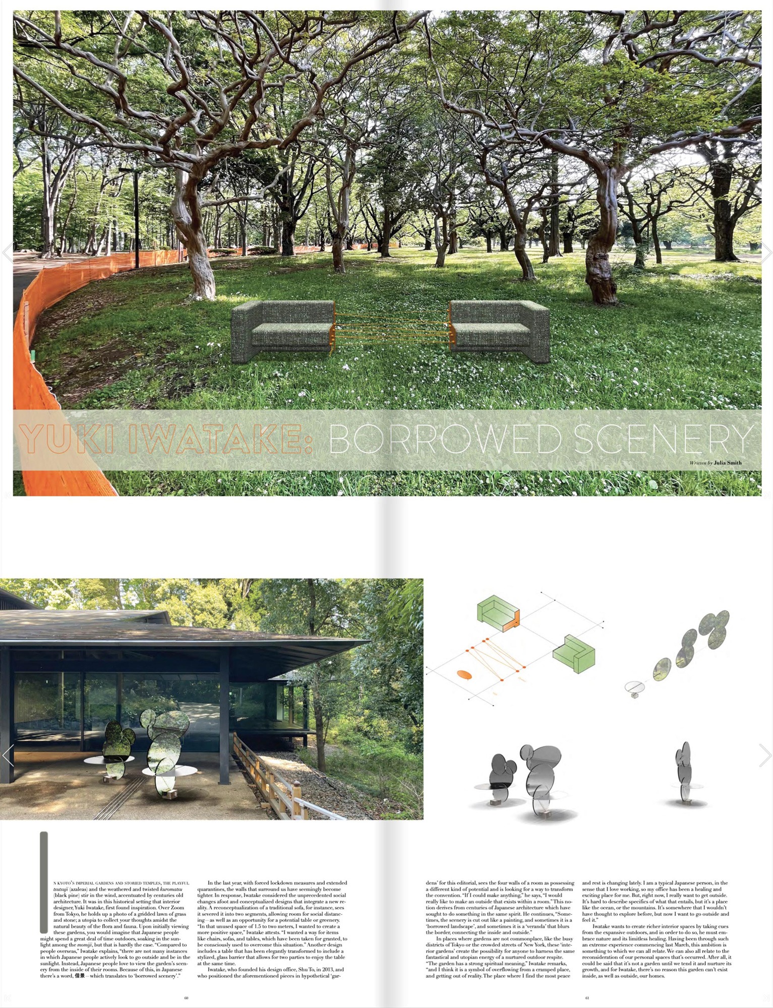
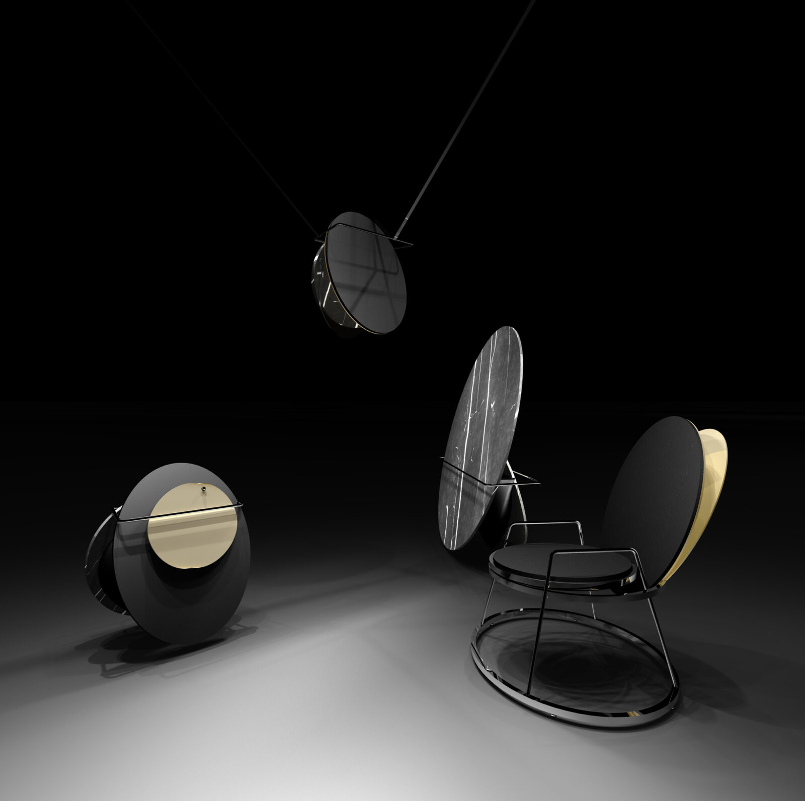
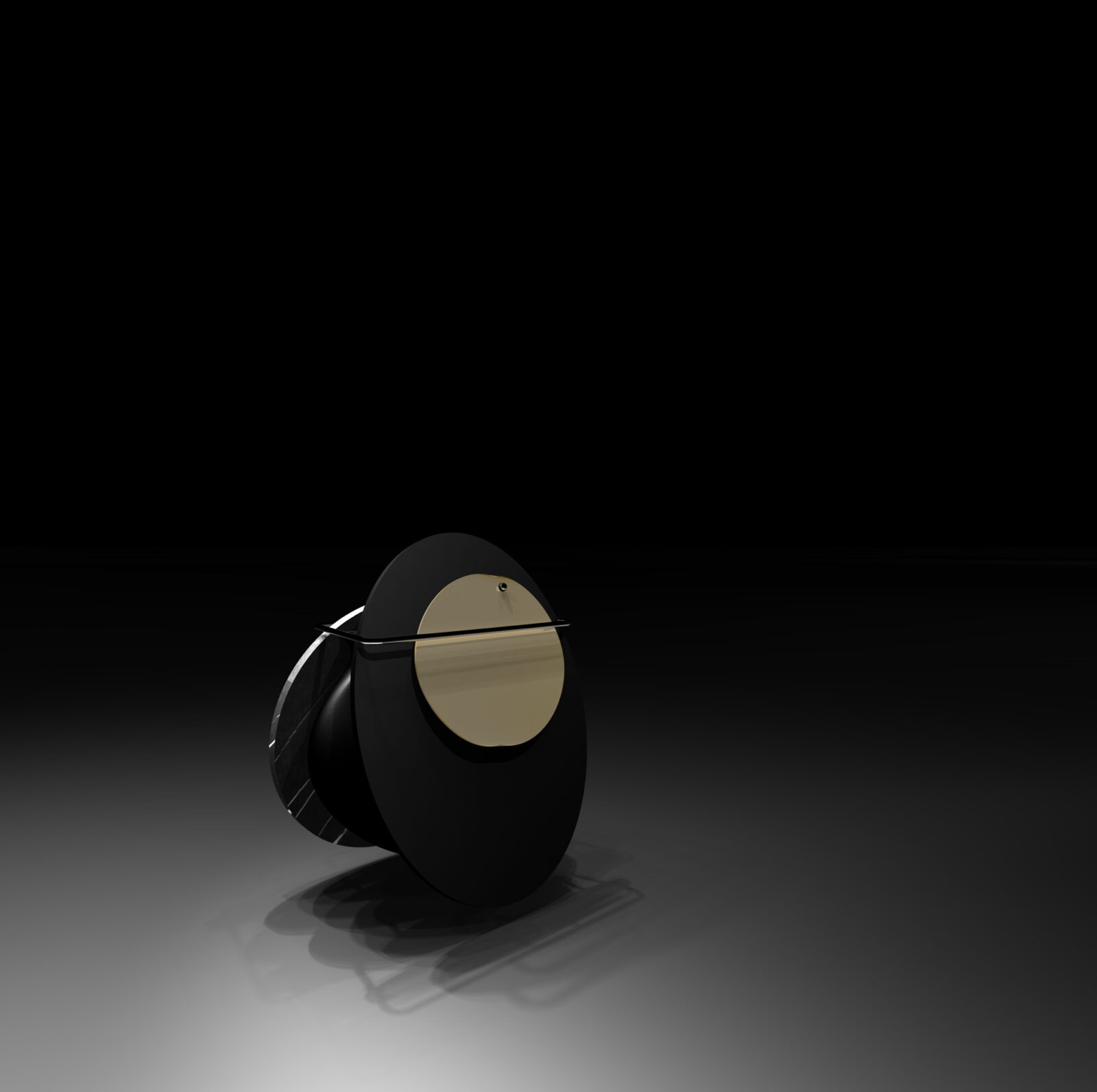
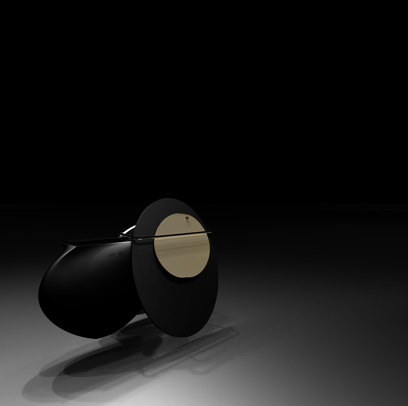
A feature on SHU TO / published in "FLAUNT MAGAZINE," the Los Angeles-based fashion and culture journal. The feature includes an interview centered on the issue’s theme, "IN THE GARDEN," alongside works designed specifically for the article.
The interview was conducted by Julia Smith. It introduced two furniture pieces conceived under the theme of "SOCIAL DISTANCING." During the dialogue, the concept of "Shakkei" (Borrowed Scenery) was utilized as a metaphor to discuss a uniquely Japanese perspective: perceiving and integrating the garden from within the interior, particularly during the COVID-19 pandemic when outdoor access was restricted.
https://flaunt.com/content/yuki-iwatake-in-the-garden -
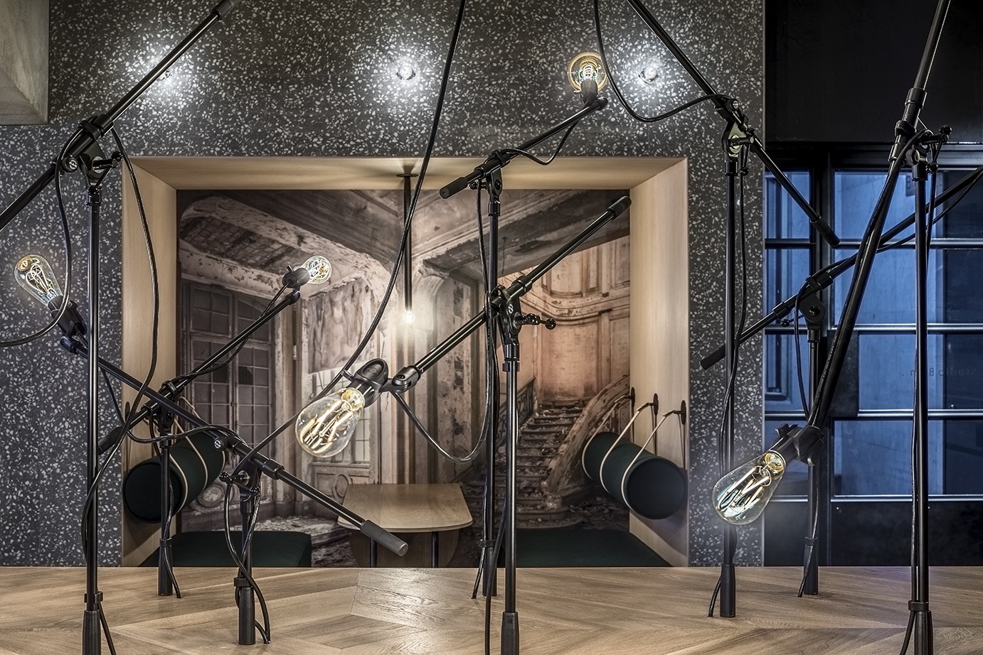
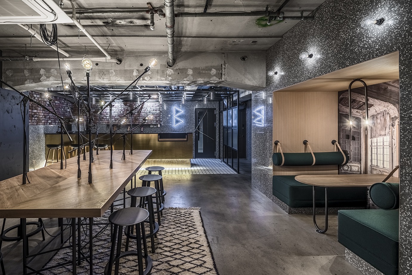
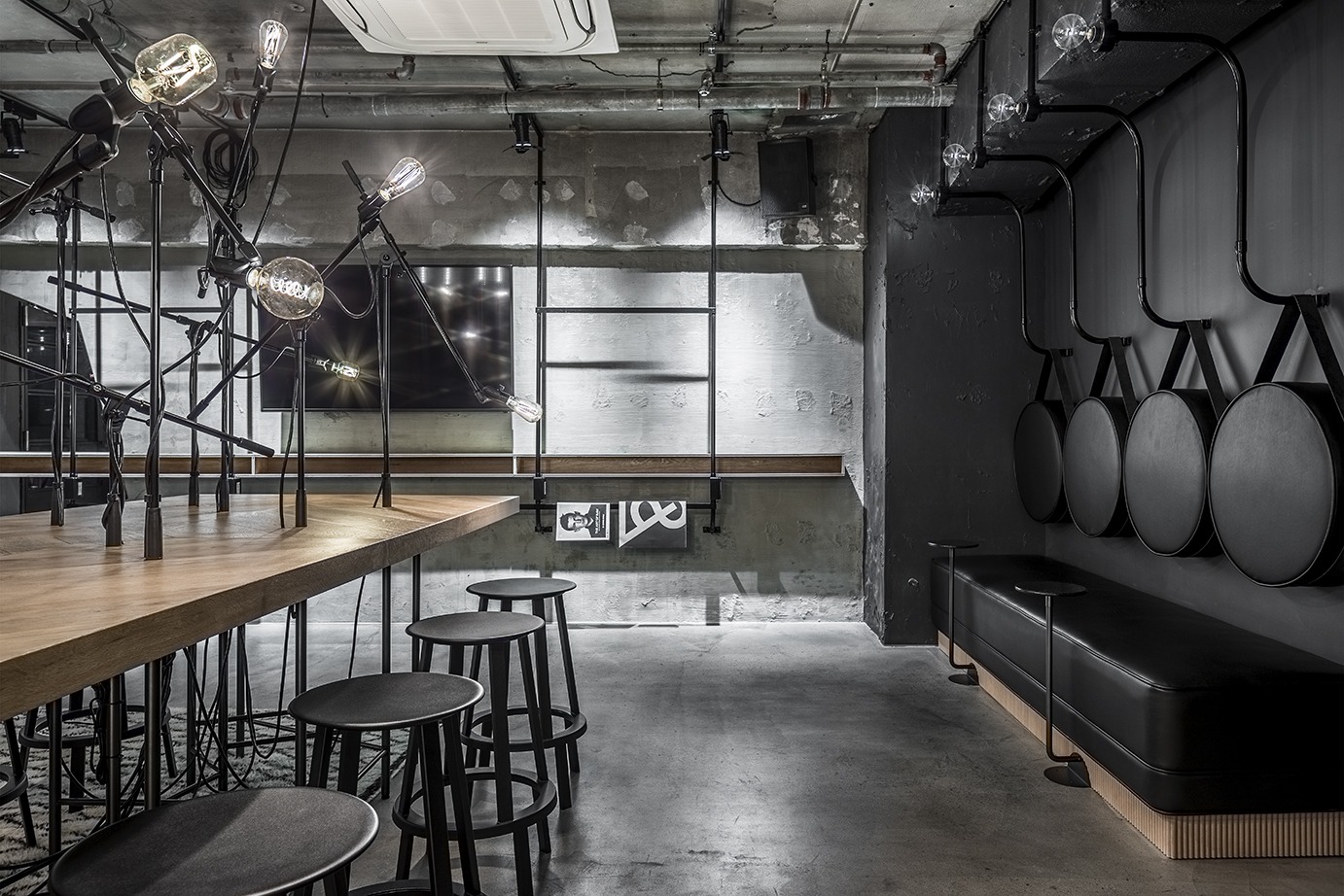
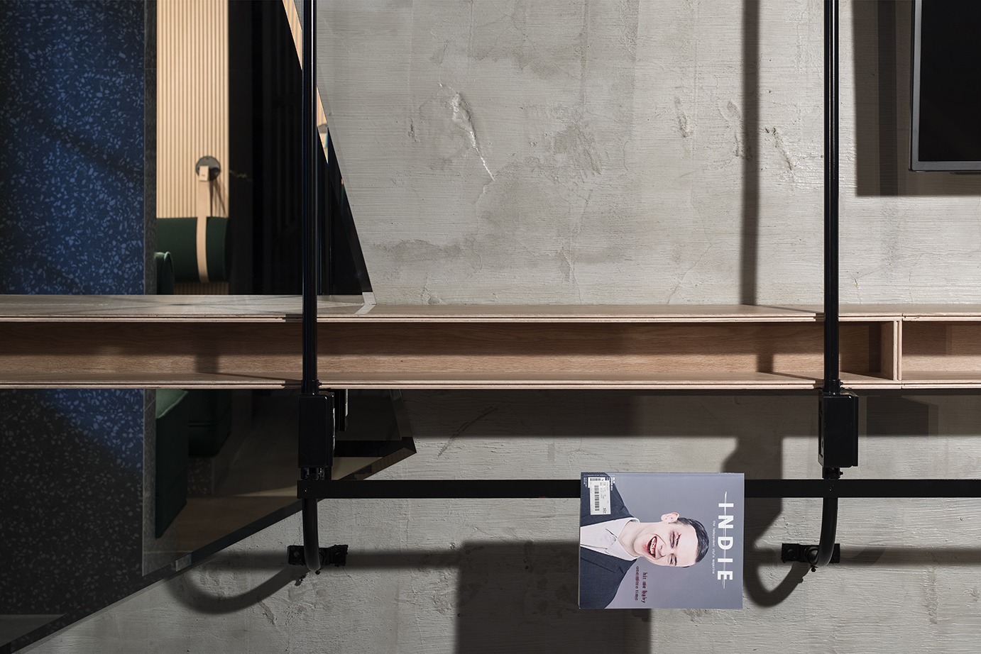
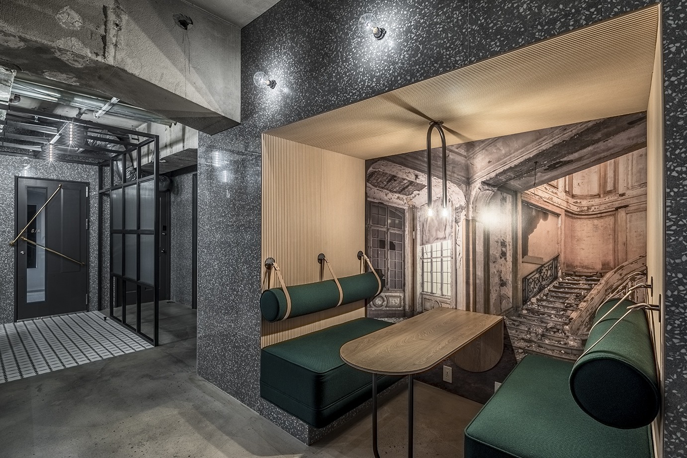
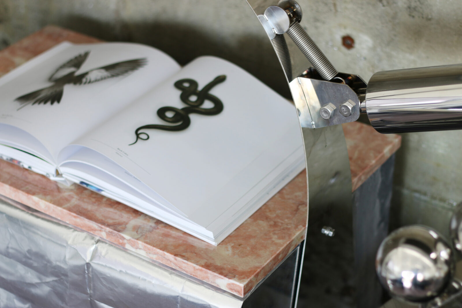
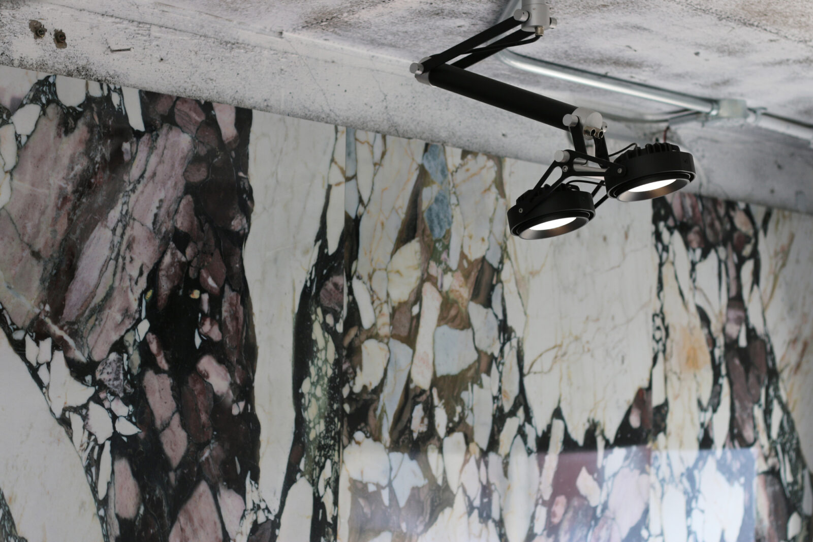
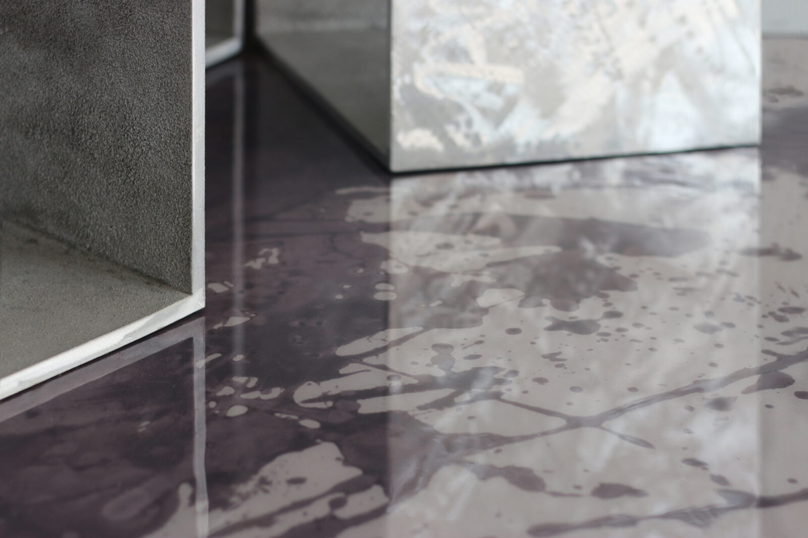
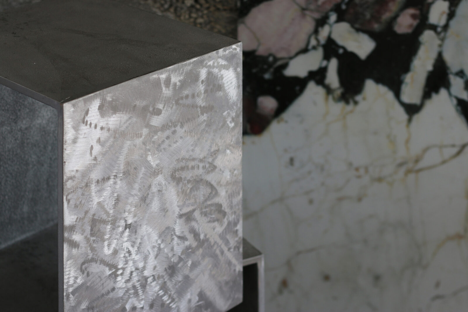
By weaving together contrasting expressions—"classical" with "modern," and "cool" with "unique"—regardless of musical genre, the design strives to render the space's "genre" itself ambiguous. The project involved the creation of architecture, lighting, tables, and chairs, featuring unique forms and premium materials, alongside combinations of brick and terrazzo.
As a symbol of a space where music gathers, the central table utilizes multiple microphone stands as its legs, expressing this concept in a unique yet contemporary manner.
-
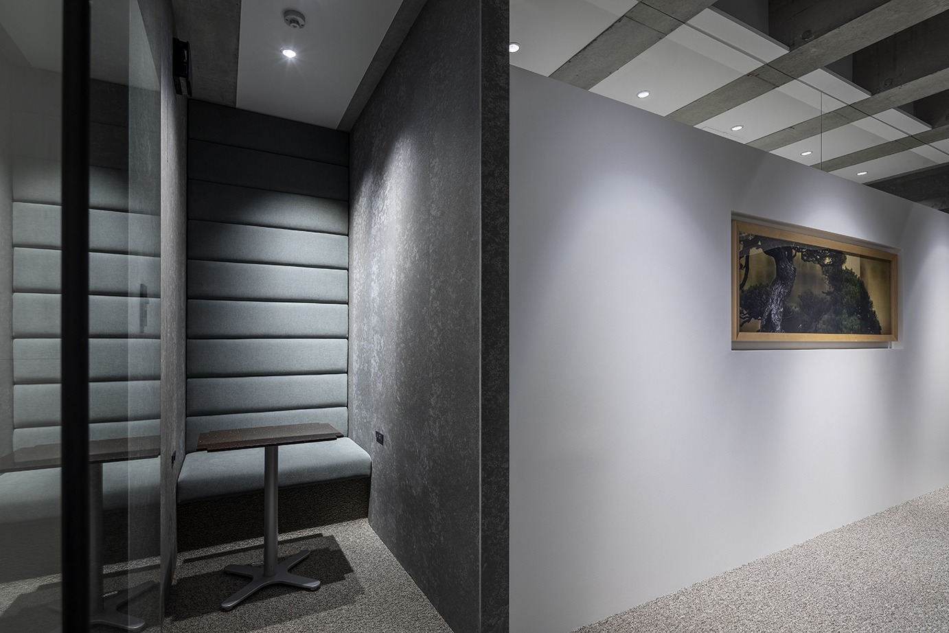
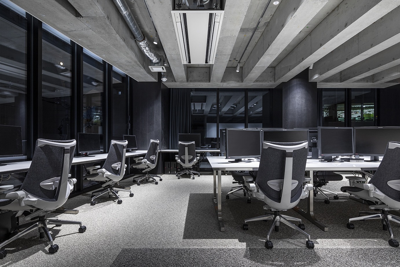
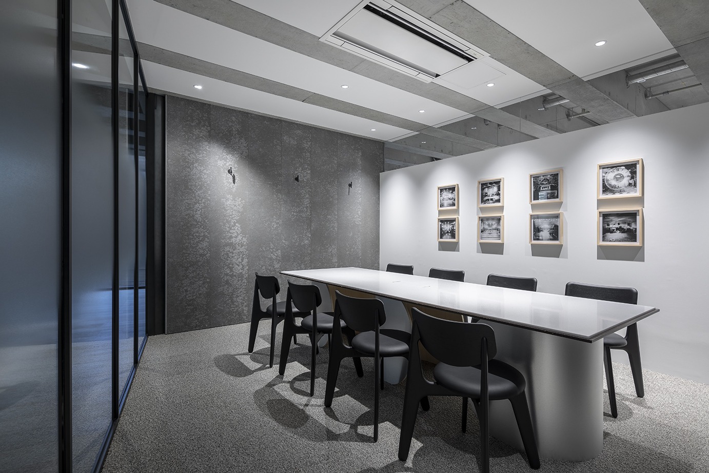
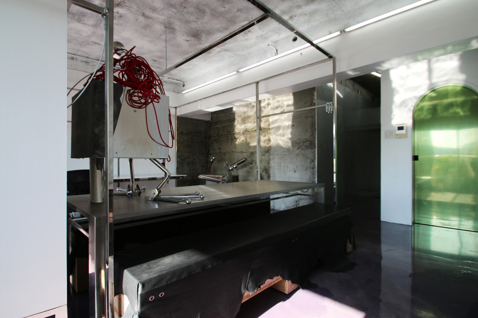
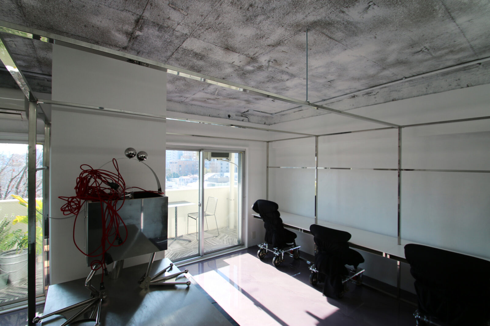
The striped beams came out when we dismaltled the existing ceiling boards. Striped pattern has effect of making objects look longer.
One of the main problem of the project was the small aera. We focused on making use of the characteristic structure to make the
space look more spacious than it really is. All objects for the ceiling were put in the gap between the beams, the walls were put along
them as well, to avoid hiding them.
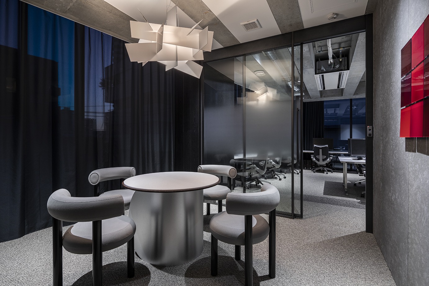
The atmosphere was designed simple, Japanese and modern. The meeting tables were designed to suit it. The tables have two top
boards each, one is modern white and another is Japanese brown. -
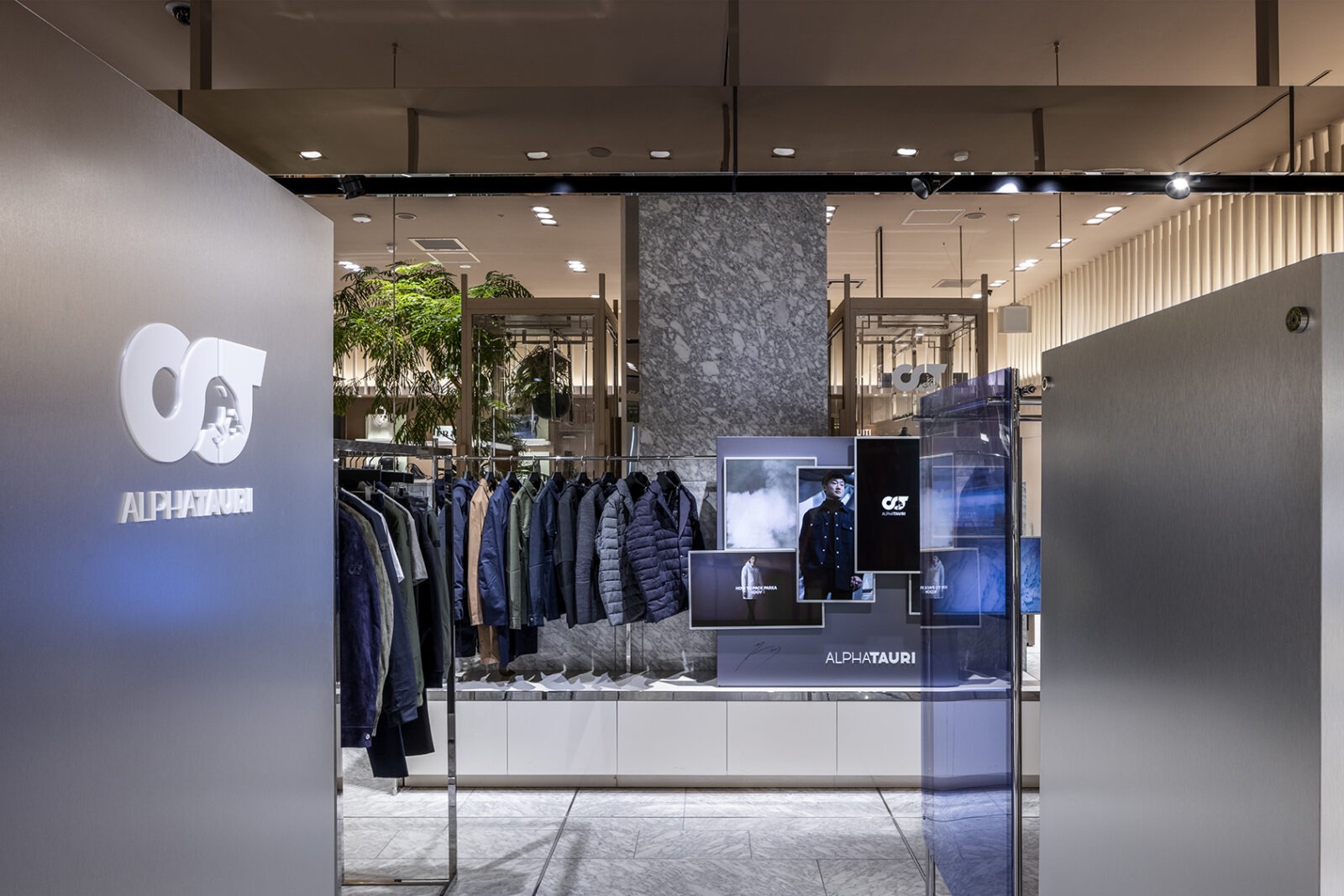
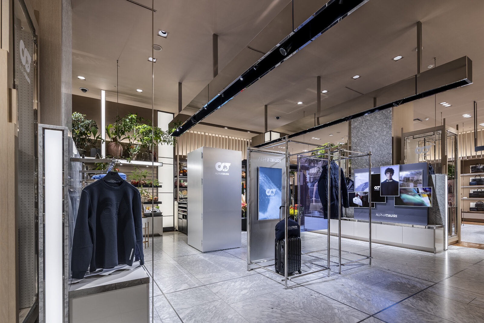
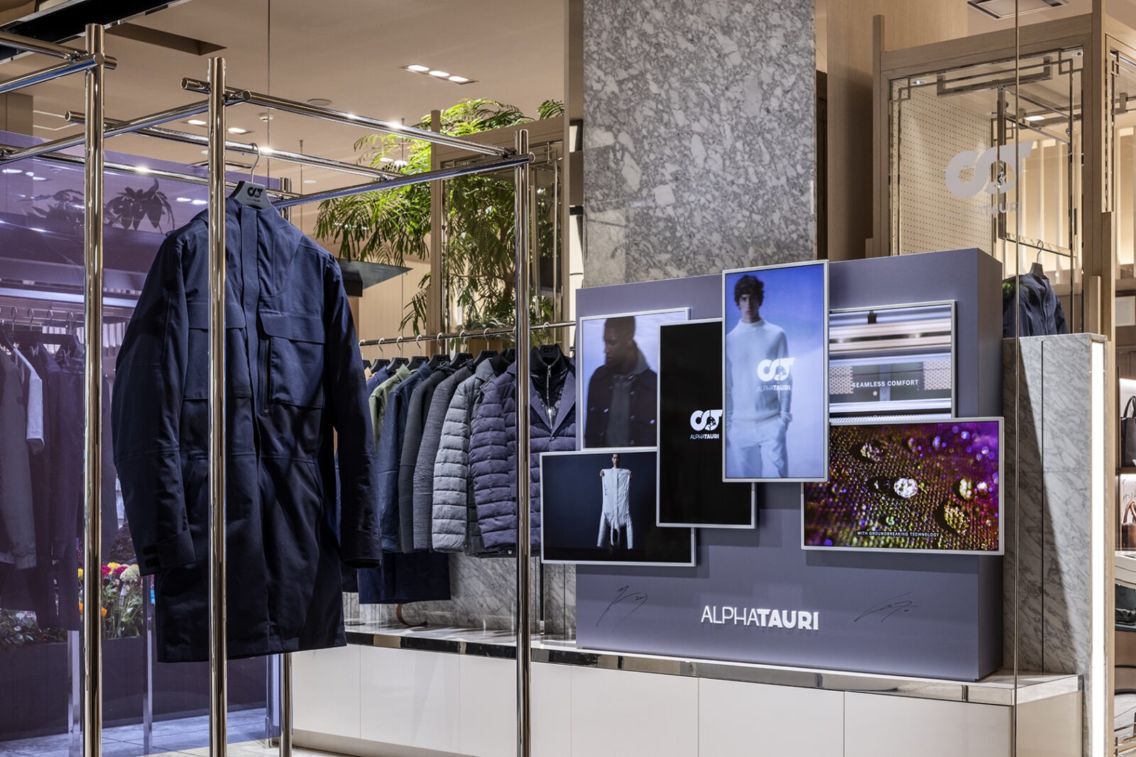
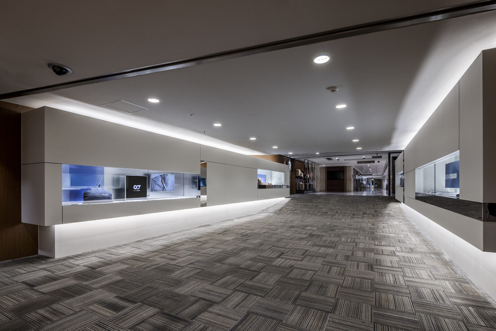
A pop-up store for the Austrian fashion brand "AlphaTauri," launched to coincide with its arrival in Japan at Isetan Shinjuku. SHU TO / was responsible for the interior planning and the design of the facility’s show windows.
The space was composed using the brand’s 2022-2023 AW key color, blue, alongside a rhythmic arrangement of video displays and atmospheric staging, evocative of a live orchestra.
-
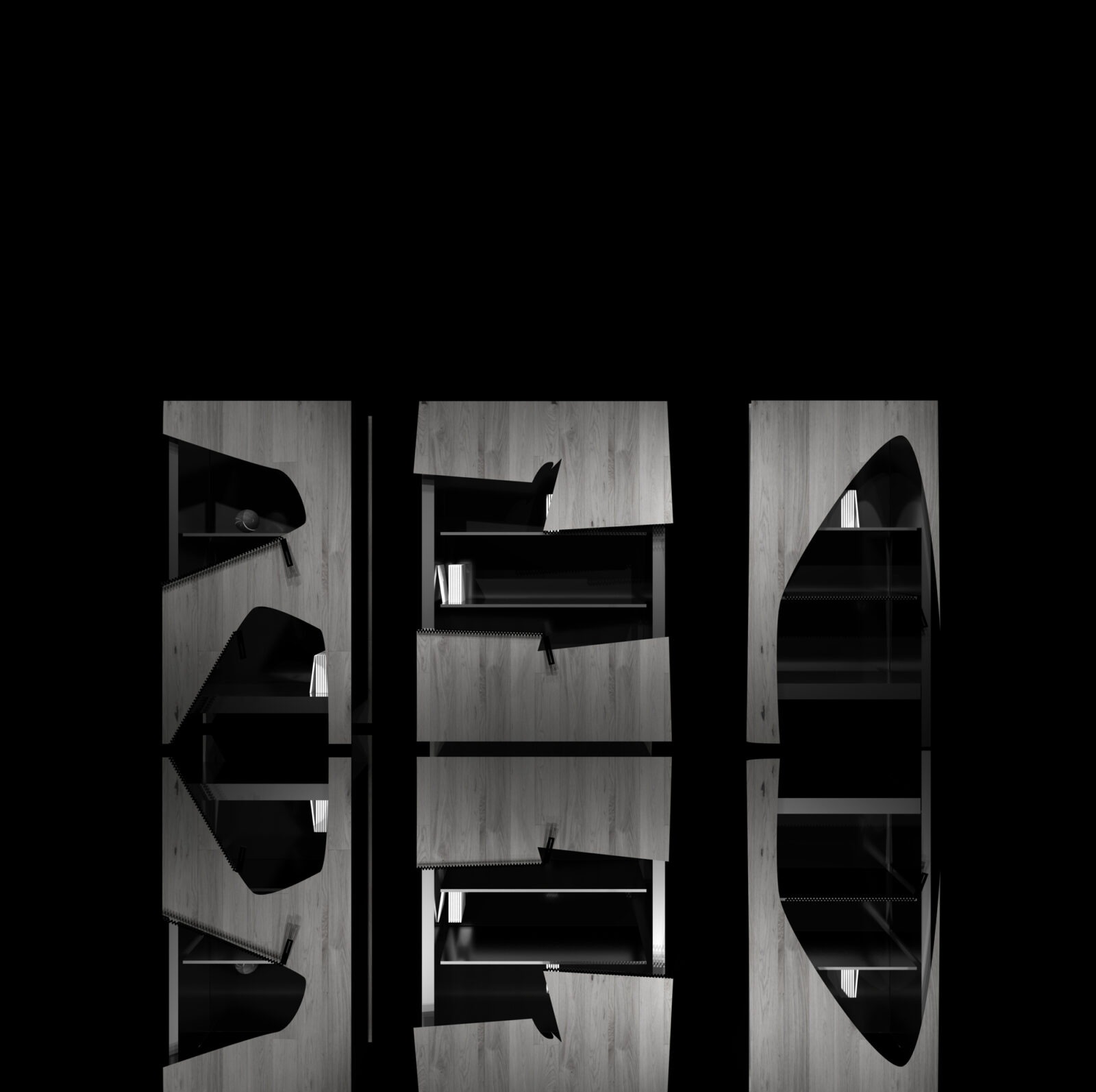
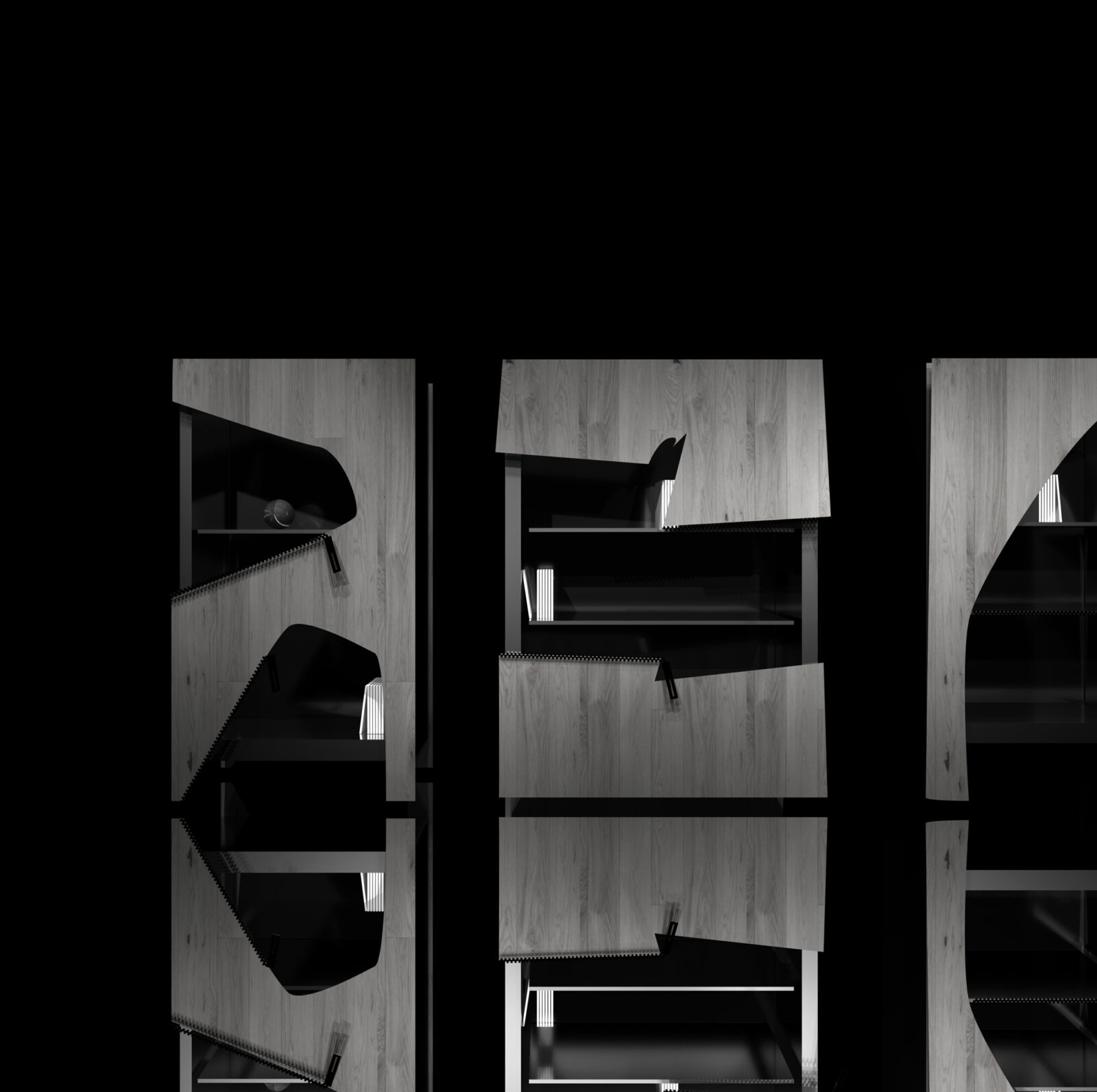
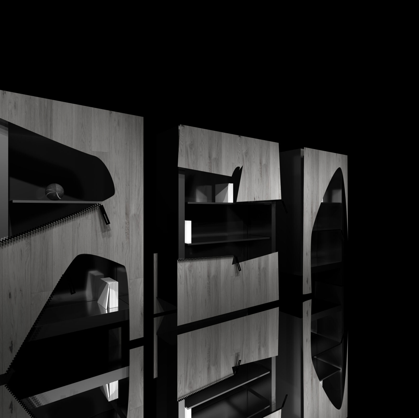
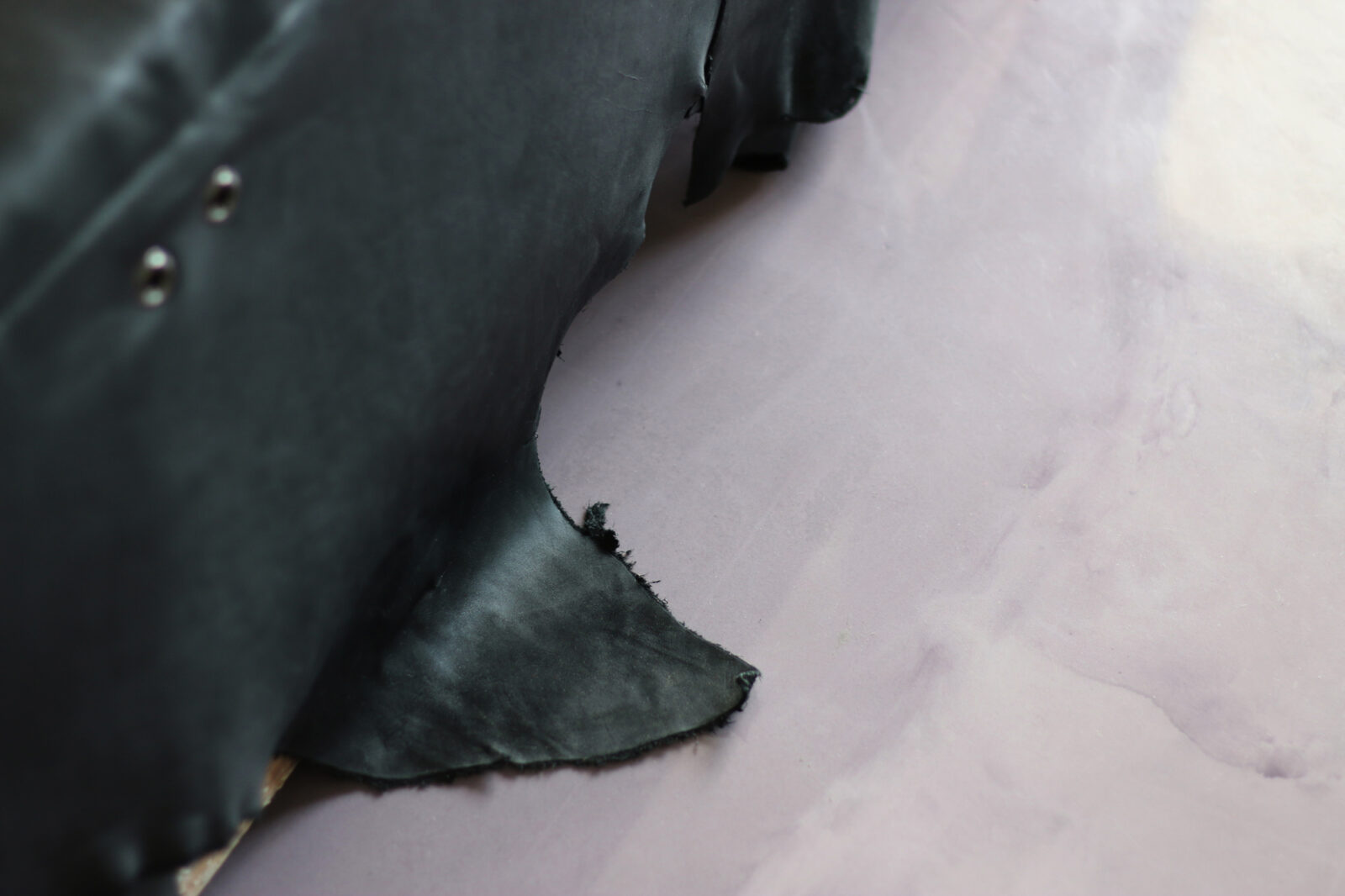
A storage cabinet design inspired by the organic patterns of woodworms. By incorporating irregular apertures in the doors, the piece achieves a dual nature: displaying what is meant to be seen while concealing what is meant to be stored. A single object that harmonizes two opposing functions.
-
Designing Expression into Furniture
A creative studio that expresses spatial concepts and brand identities through furniture and fixtures as essential functional elements.
-


Rethinking the act of "partitioning," the project expands the definition of what a partition can be. By layering circular forms of varying sizes, the series "partitions" space; "partitions" waste bins from the surrounding environment; "partitions" luggage and documents from the chair's backrest; and "partitions" the light source within the illumination.
-
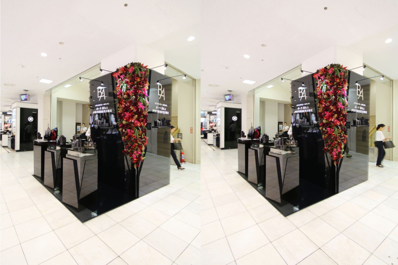
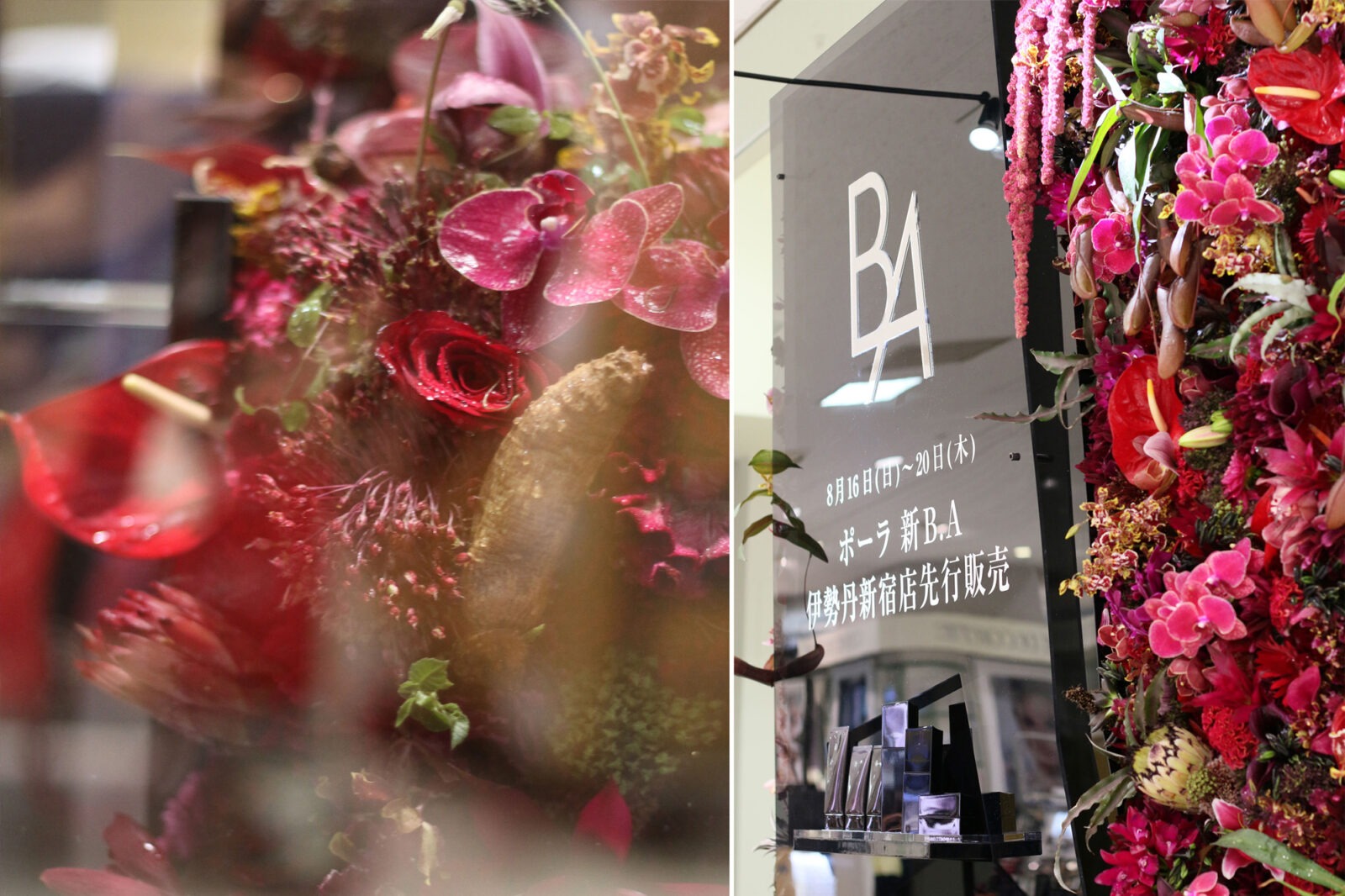
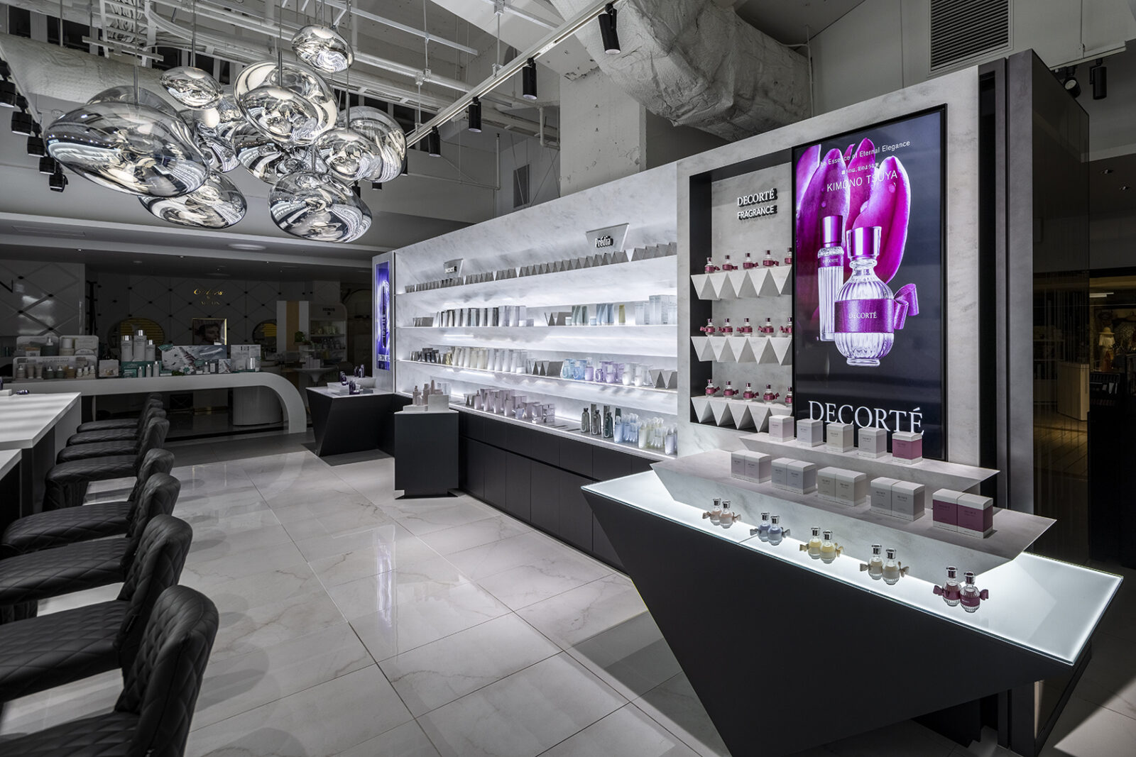
A pop-up store for the launch of new products from the cosmetics brand "POLA B.A," located within the promotion space of Isetan Shinjuku. SHU TO / was responsible for the spatial direction and design.
The design embodies the brand concept: "Inner beauty, dormant in the deep layers, awakens as if a switch has been flipped." This was expressed through flowers that appear to burst through the walls and fixtures from within, blooming vividly. Viewed through black glass, the flowers appeared even more powerful and vibrant.
-
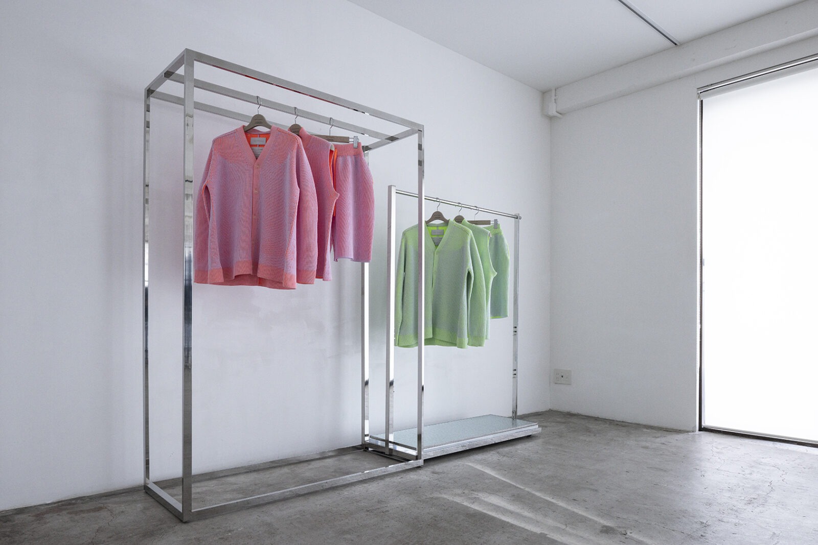
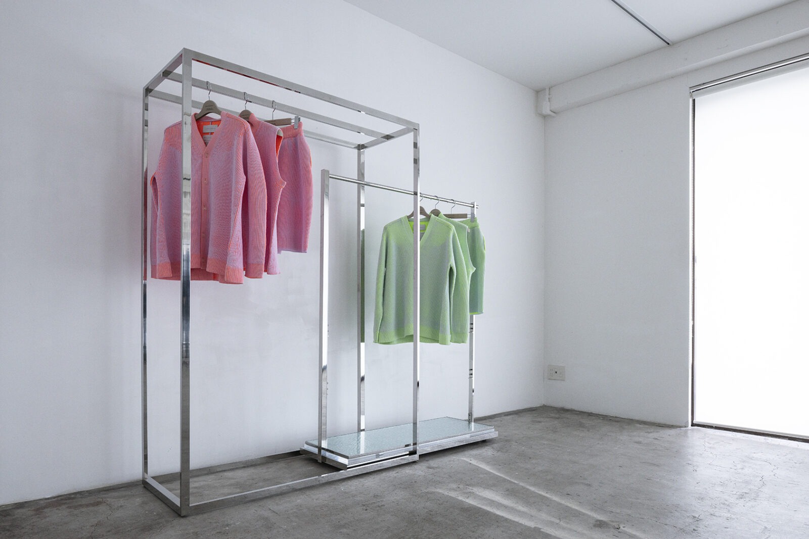
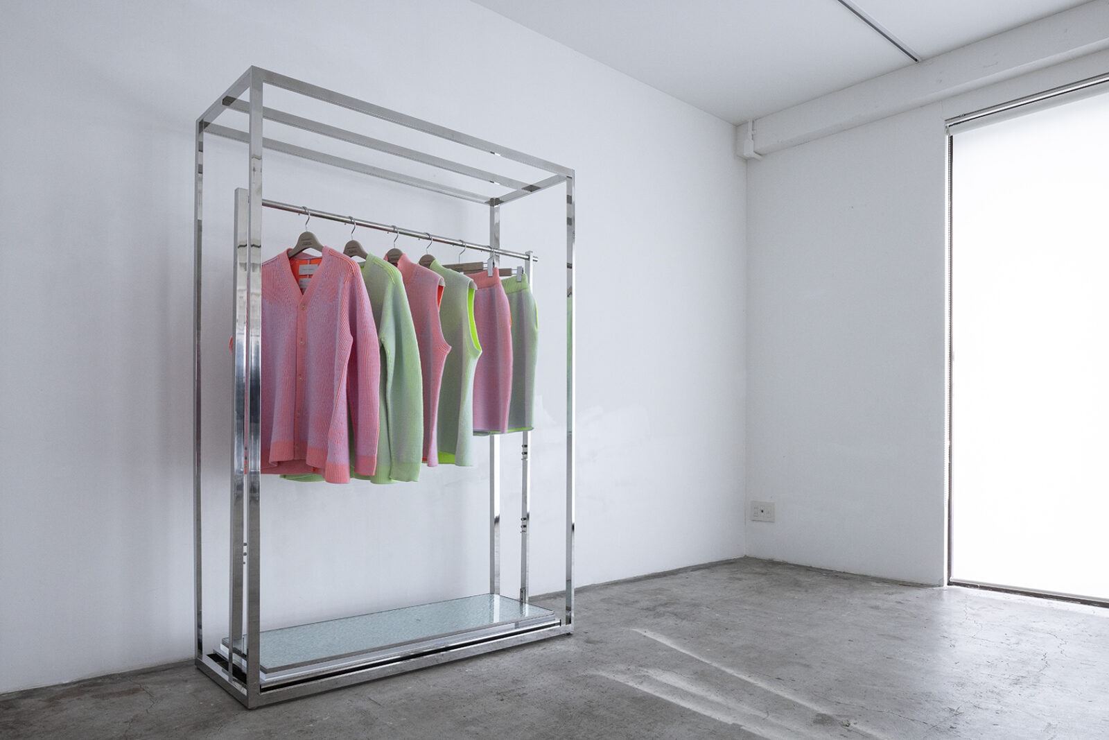
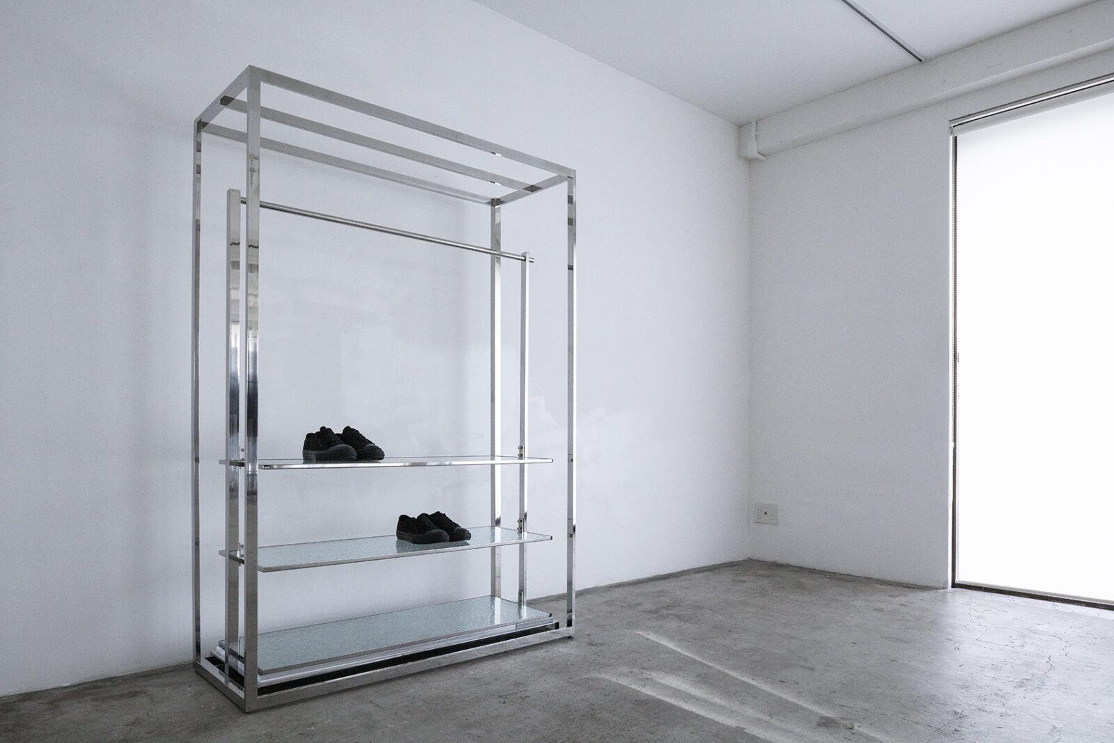
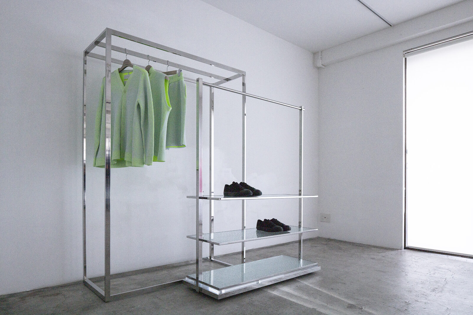
Development of the "NESTING HANGER RACK," designed to allow the degree of overlap to be adjusted according to the volume of items or the installation environment.
This nesting capability not only optimizes the floor space required but also expands the possibilities for various display expressions. The glass bases can be attached as shelves, and the large and small hanger racks can also function as independent units. -
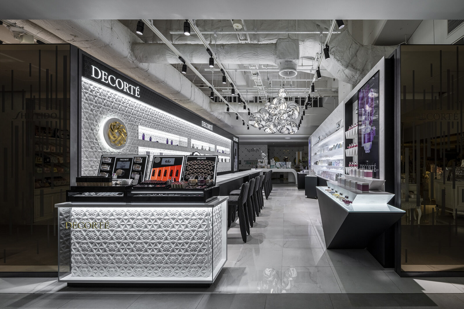
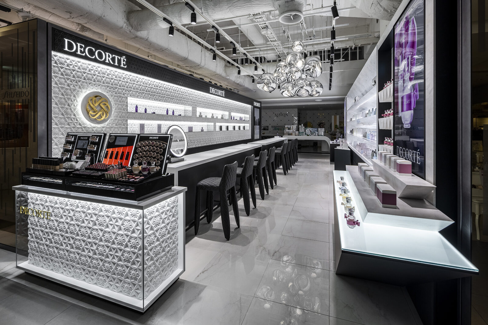
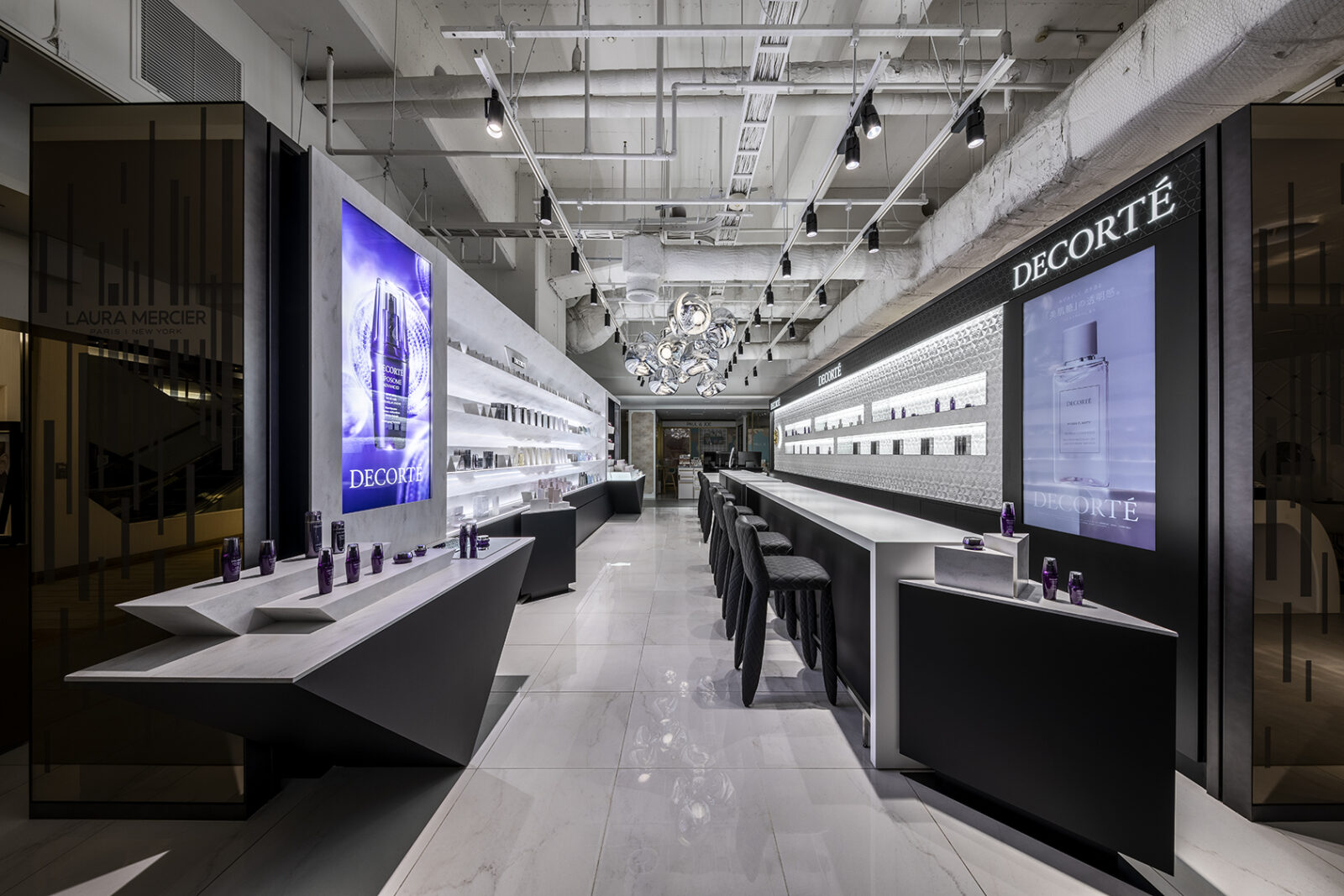
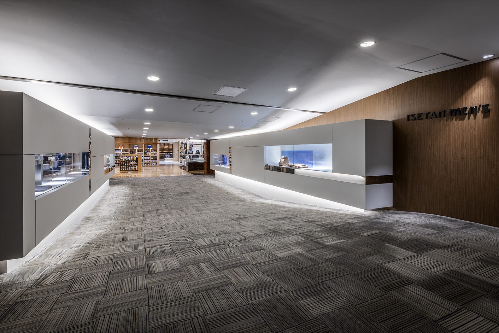
Given the narrow, elongated site that functions like a thoroughfare, the design required a magnetic pull to draw visitors into the space. In response, a continuous zigzag motif was employed. This expression creates a spatial flow that pulls the observer inward while simultaneously organizing a vast number of products, with each zigzag element serving to elevate the presence of the individual items.
-
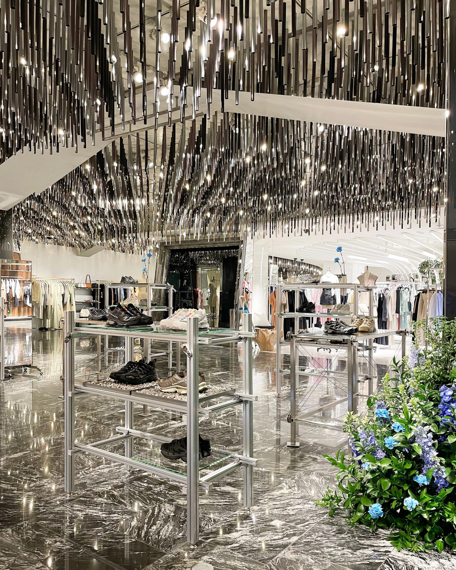
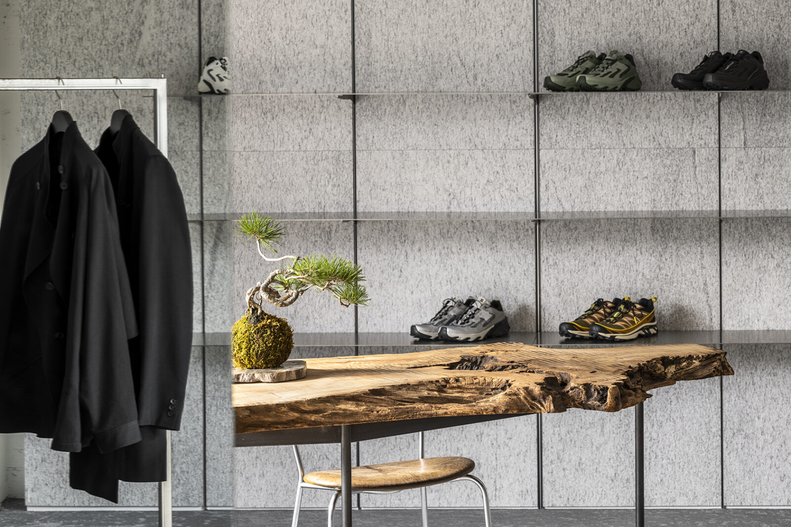
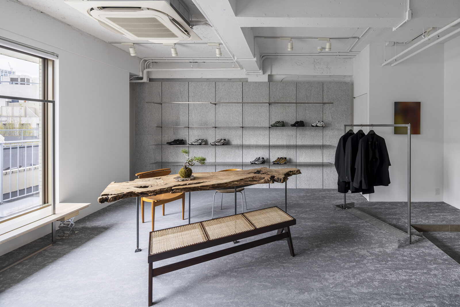
Display fixture design for a pop-up store of the French brand "Salomon."
The fixtures utilize aluminum frames, with the discarded remnants repurposed to create single-flower vases. Reflecting Salomon's heritage in mountaineering, carabiners are integrated as functional fasteners for the frames, subtly infusing the brand’s rugged worldview into the structural details. -
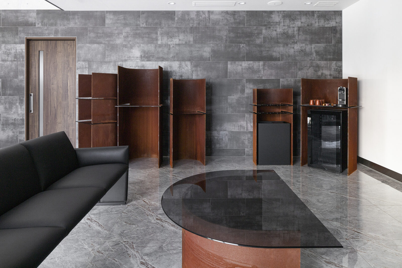
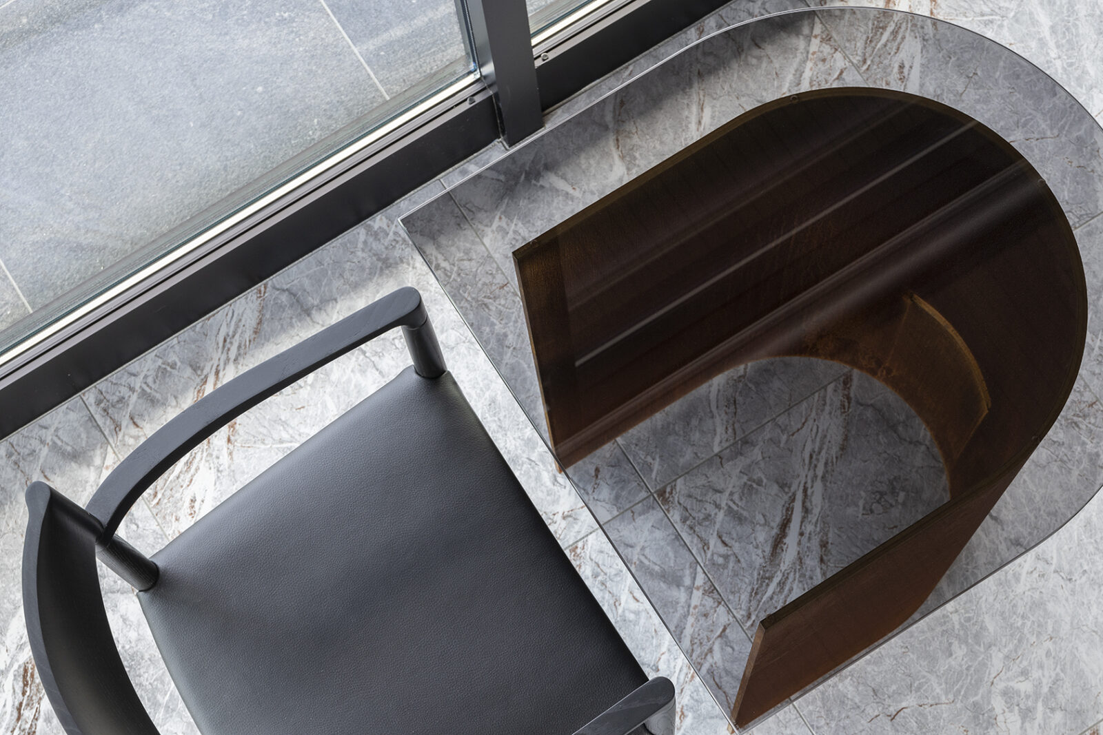
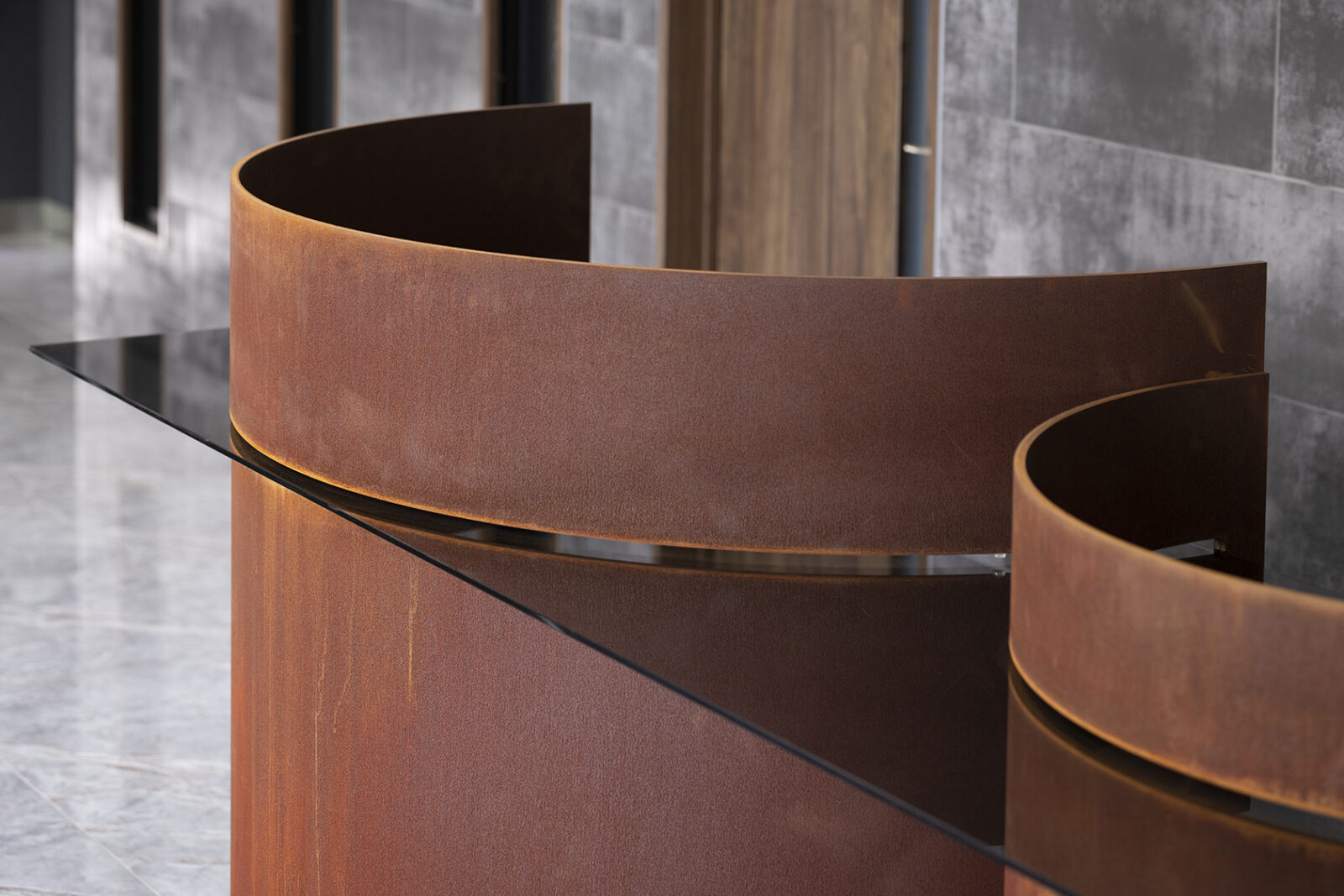
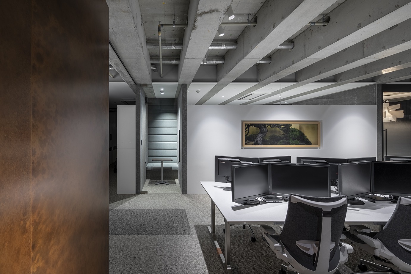
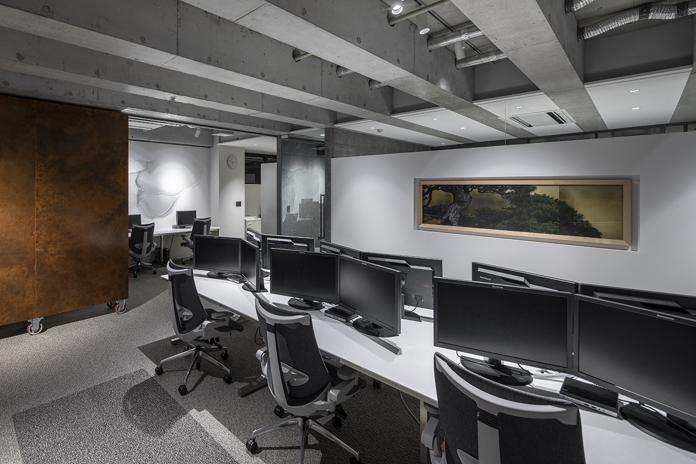
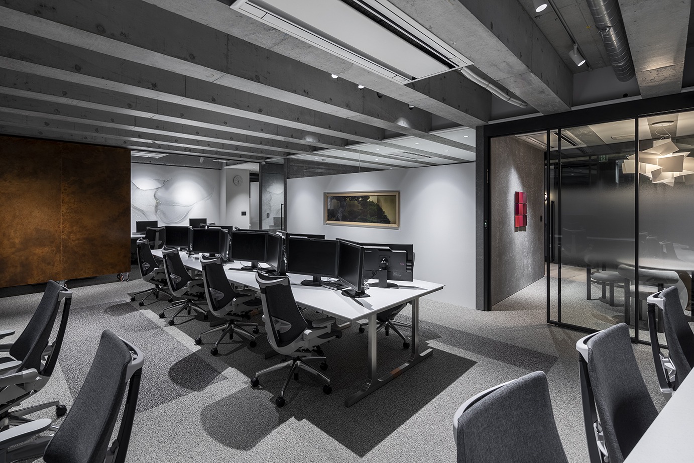
2023.11.01 Electric Vehicle Gathering Place
To harmonize with the futuristic presence of the cars, steel plates rusted over several weeks prior to construction were used for the furniture, creating a contrast within the space.
The furniture is constructed without any fixing hardware; instead, glass tops are inserted into dynamic, deep slits. Relying solely on the precision bending of the steel plates, the structure creates an aesthetic where the glass appears to vanish into the depths of the slits.
The authentic texture of the rust, evoking a sense of long-standing existence, achieves a profound harmony with the space, while the sharp contrast with the glass elevates the refined presence of the pieces. -
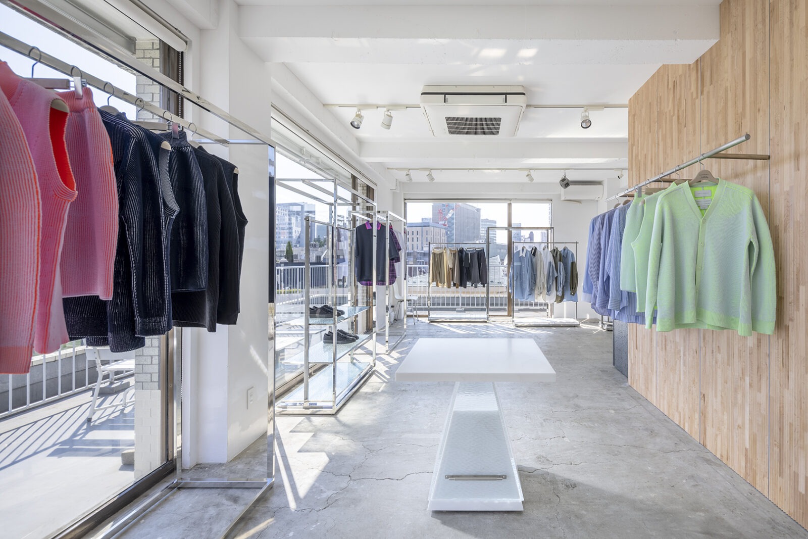
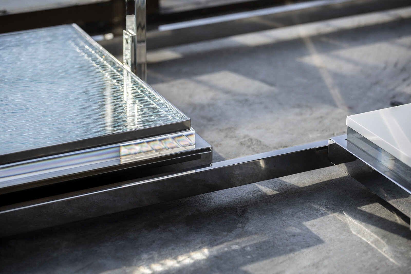
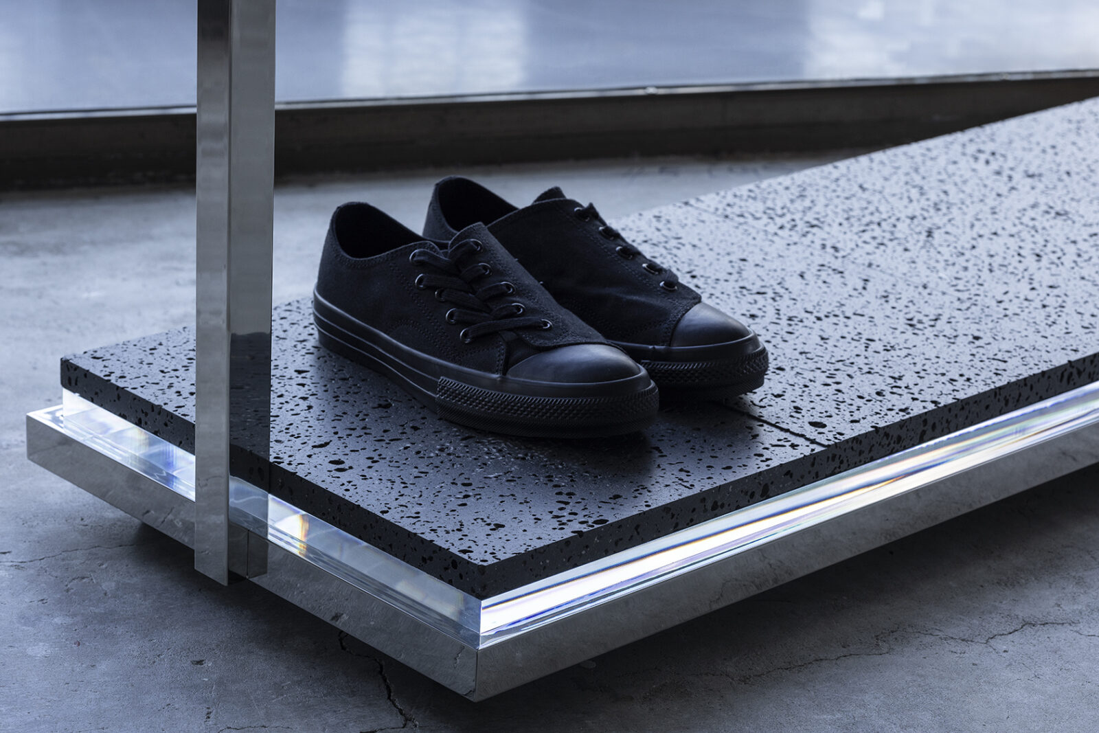
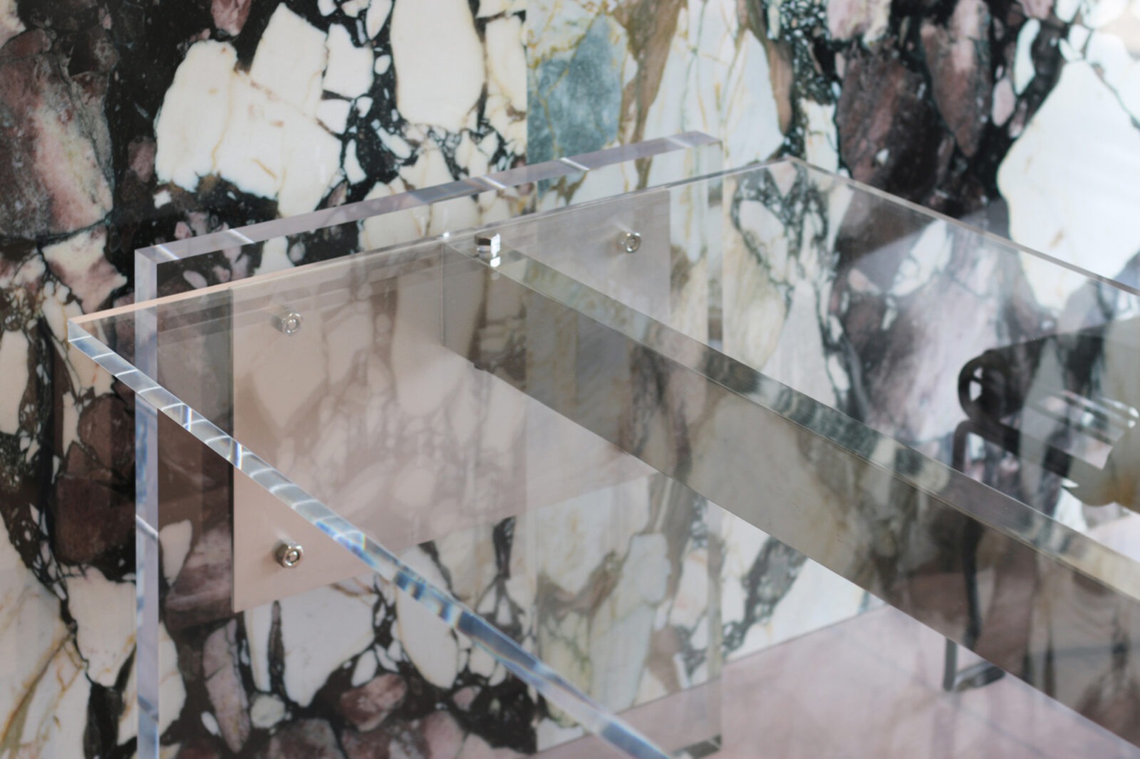
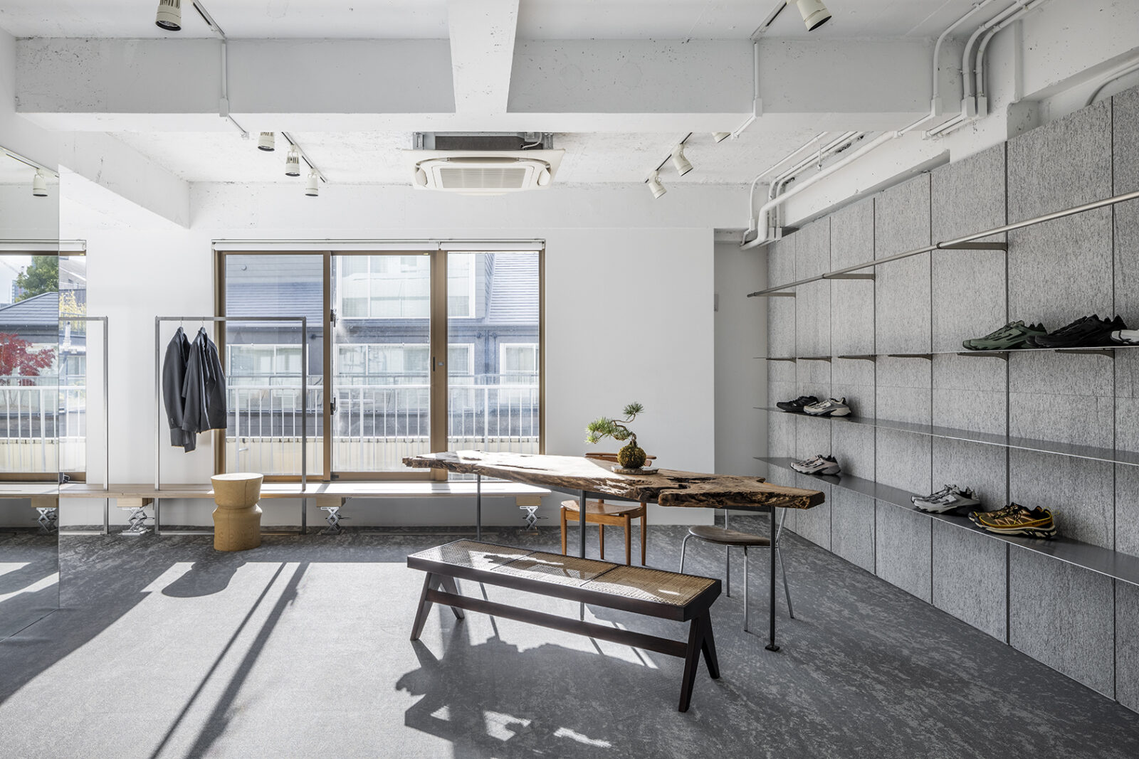
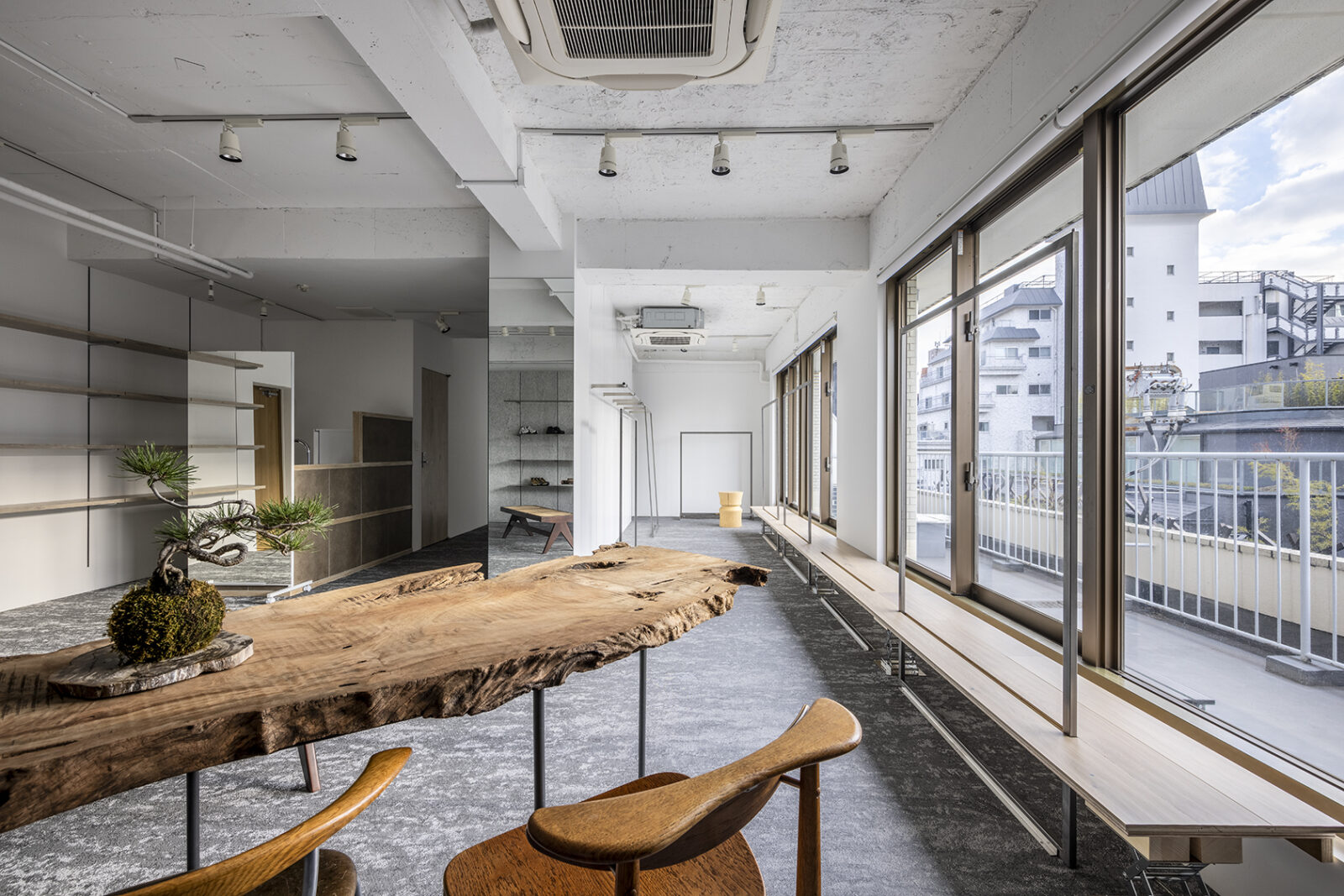
Design and production of display fixtures and furniture for the "ON TOKYO SHOWROOM." To accommodate diverse products and varying quantities, the fixtures utilize a "nesting" structure.
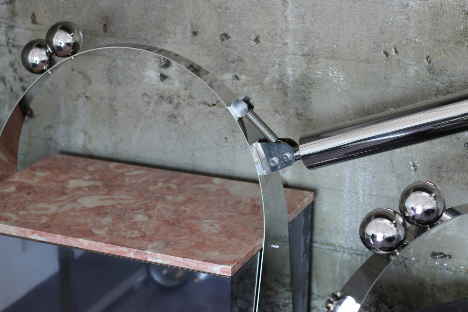
This simple, versatile design allows the volume of the fixtures to be adjusted through layering, creating a rhythmic arrangement that enables a wide range of display expressions. The tables feature transparent legs crafted from acrylic and specialized glass, striving for an aesthetic that is both precarious and ethereal.